Nationwide building society
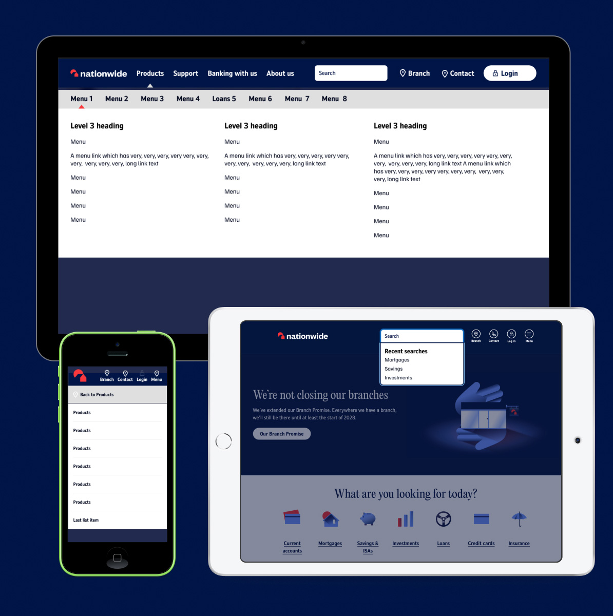
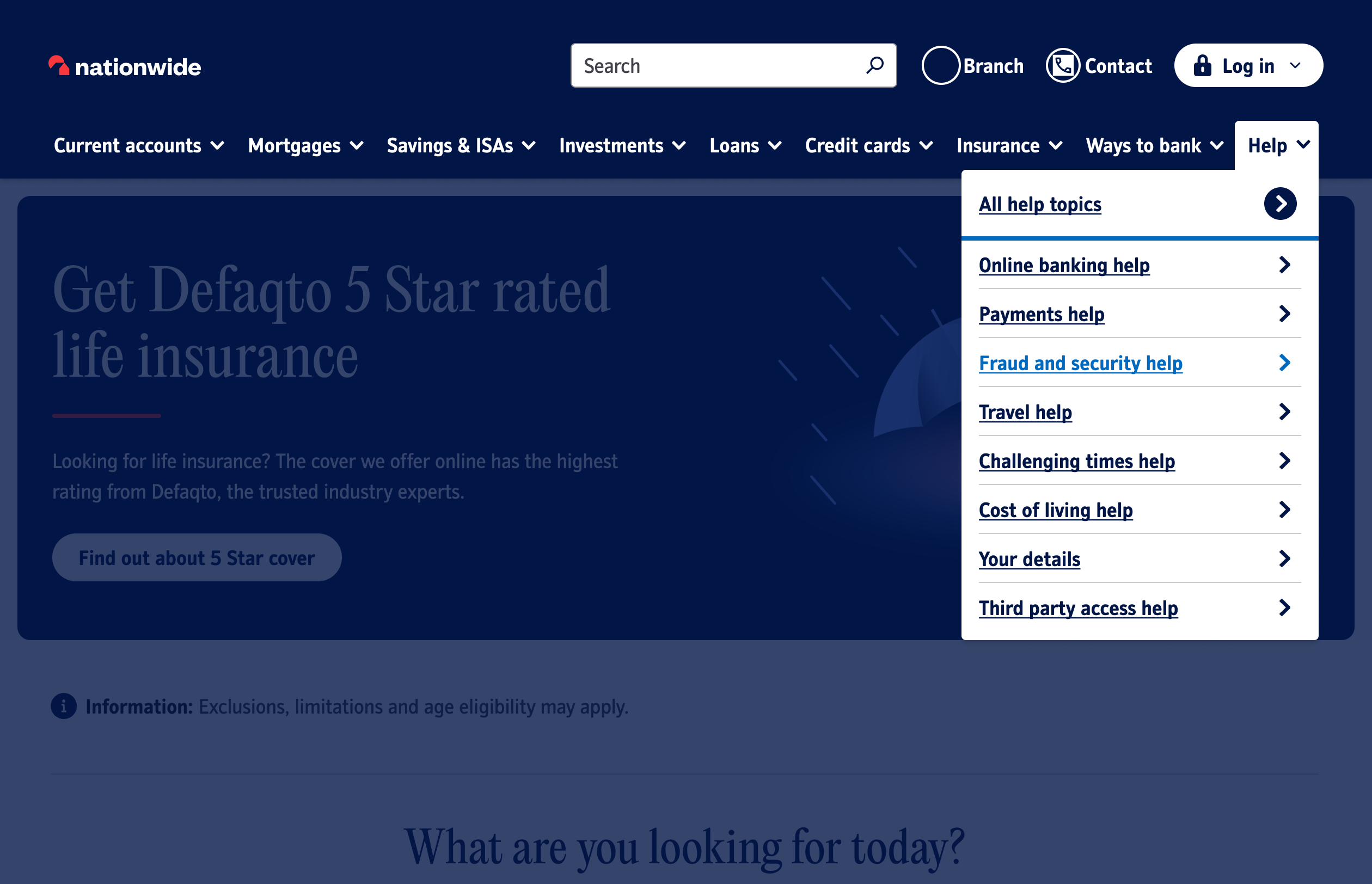
Since joining Nationwide, I have been embedded in the Global UK team and heavily involved in the re-brand of the .co.uk site. Nationwide has undergone dramatic change in its appearance to freshen-up and bring it in line with its competitors and peers like Monzo, Revolut and HSBC – to name a few. The following work is a project showcasing the redesign of the global navigation from current to future considering appearance, usability and interactions.
Nationwide
UI/UX
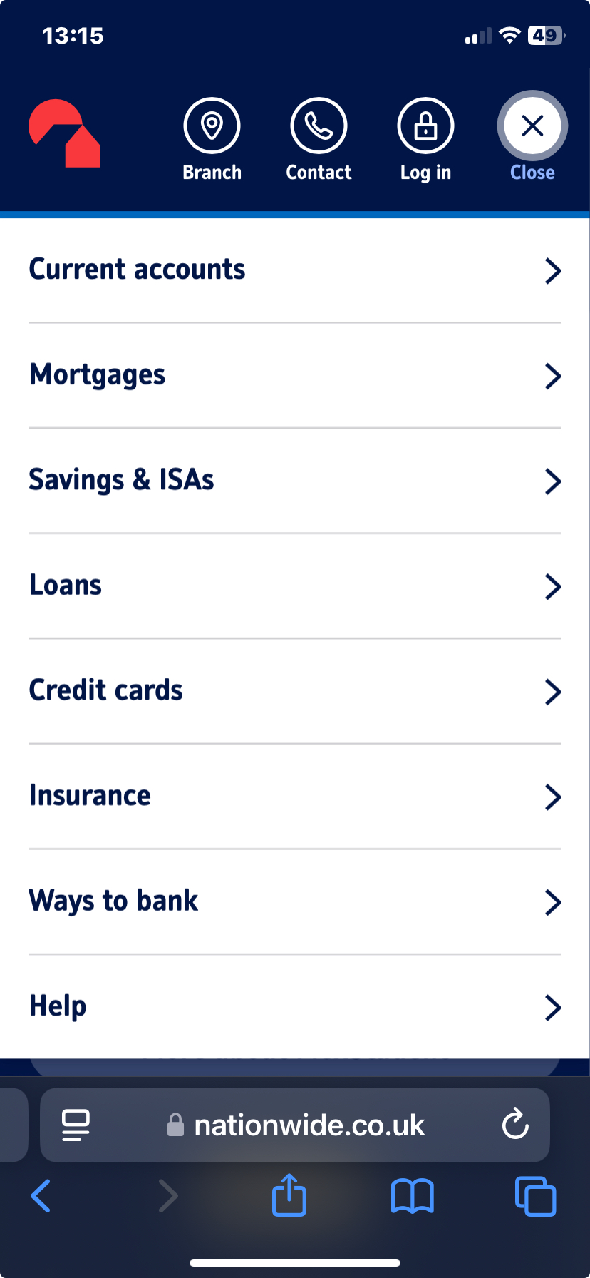
The main navigation of nationwide.co.uk was scoring low in usability and accessibility testing.
A new solution was set by Product to allow for better accessibility and opportunity to grow with the newly launched branding.
What I did
- Concepting
- User interface
- User journey/wireframing
- Prototyping
- Testing
- Production
- Stakeholder management
Problem
We have received feedback on the current live navigation from the business and customers on accessibility and versatility for the new branding:
- Usability, accessibility and SEO issues
- No ability to include membership/other strategic change (in line with new corporate strategy)
- Login fly-out usability
- Contact us, branch finder, help duplication
- Purpose of ways to bank/ digital promotion
- Sales-led. A lack of promotion of existing member support
- Lack of exploitation of personalisation
- No marketing opportunity in the current layout
- Depth and lack of 'stickiness'
Re-brand
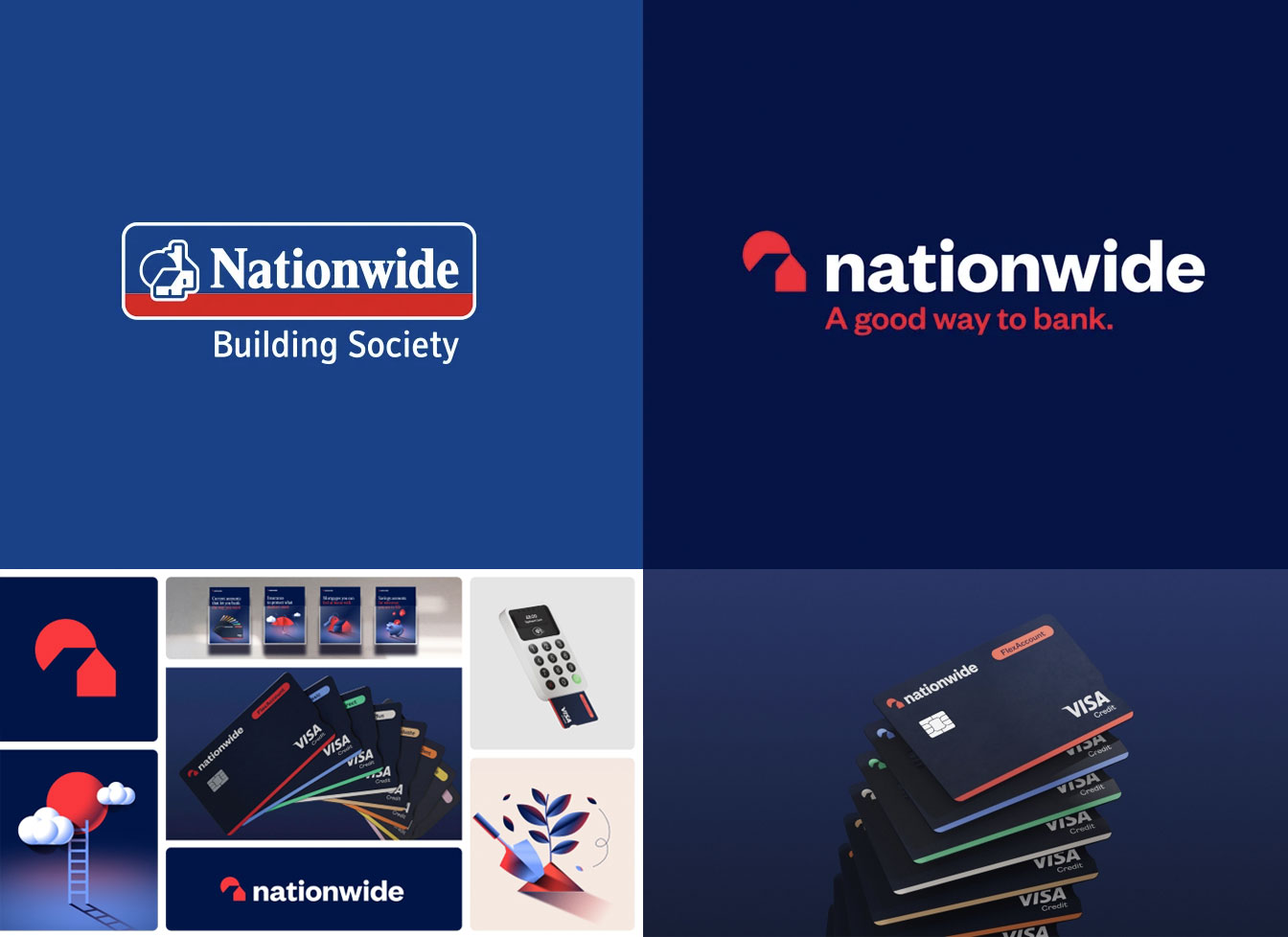
Nationwide re-brand launched in October 2023 with updated logotype, fonts, colours, illustrations and iconography. Part of the re-brand has been to modernise the navigation and improve usability in the IA and accessibility for users. Me and my team have taken a deep-dive to understand how our users interact with the navigation and why some items are harder to find than others.
Insights
We gathered key information from Adobe analytics to understand user behaviour.
- Mobile has overtaken Desktop as the top device for visits including navigation on .co.uk
- Internet Bank visits play a large factor in this as they make up 9 in 10 users from our .co.uk traffic
- Savings, Mortgages and Current Accounts make up almost c.80% of our navigation clicks for Internet Bank users
- There is no one size fits all navigation preference for devices when looking at all journeys on .co.uk – each device has separate user behaviours for how they like to navigate the website
- Journeys from the Homepage have higher proportions of icon block usage over header/navigation bar
- Search is the most common header navigation tool for non-Internet Bank users and handheld devices
- Less than 1 in 10 users navigate to Get in Touch in the Footer compared to the Utility link usage
What we did 30 websites
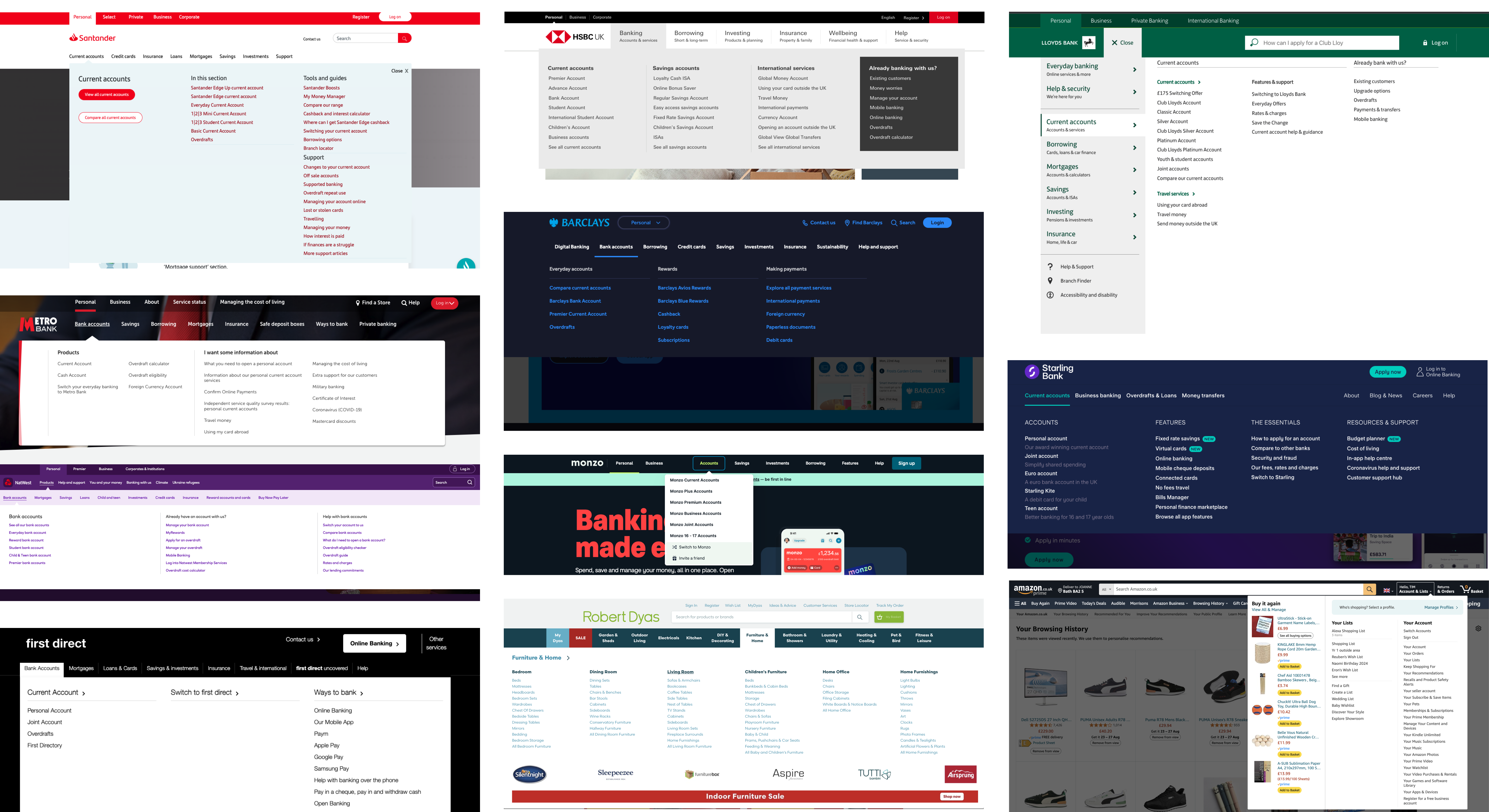
As a team we analysed the navigations of 30 websites across 5 industries: Banking, Travel, Supermarkets, Retail and Telecomms.
Standardised criteria
We agreed a predetermined bench mark to make our analysis consistent and meaningful. For example: Was there a search bar, what type of navigation, could you log-in, what additional services beyond products were being promoted and was the navigation sticky. Our approach. We took screen shots across devices with the navigation open and closed. We also recorded our screen to see any dynamic functionality like tiered navigations, fly-outs, hover and focus states.
Card sorting IA
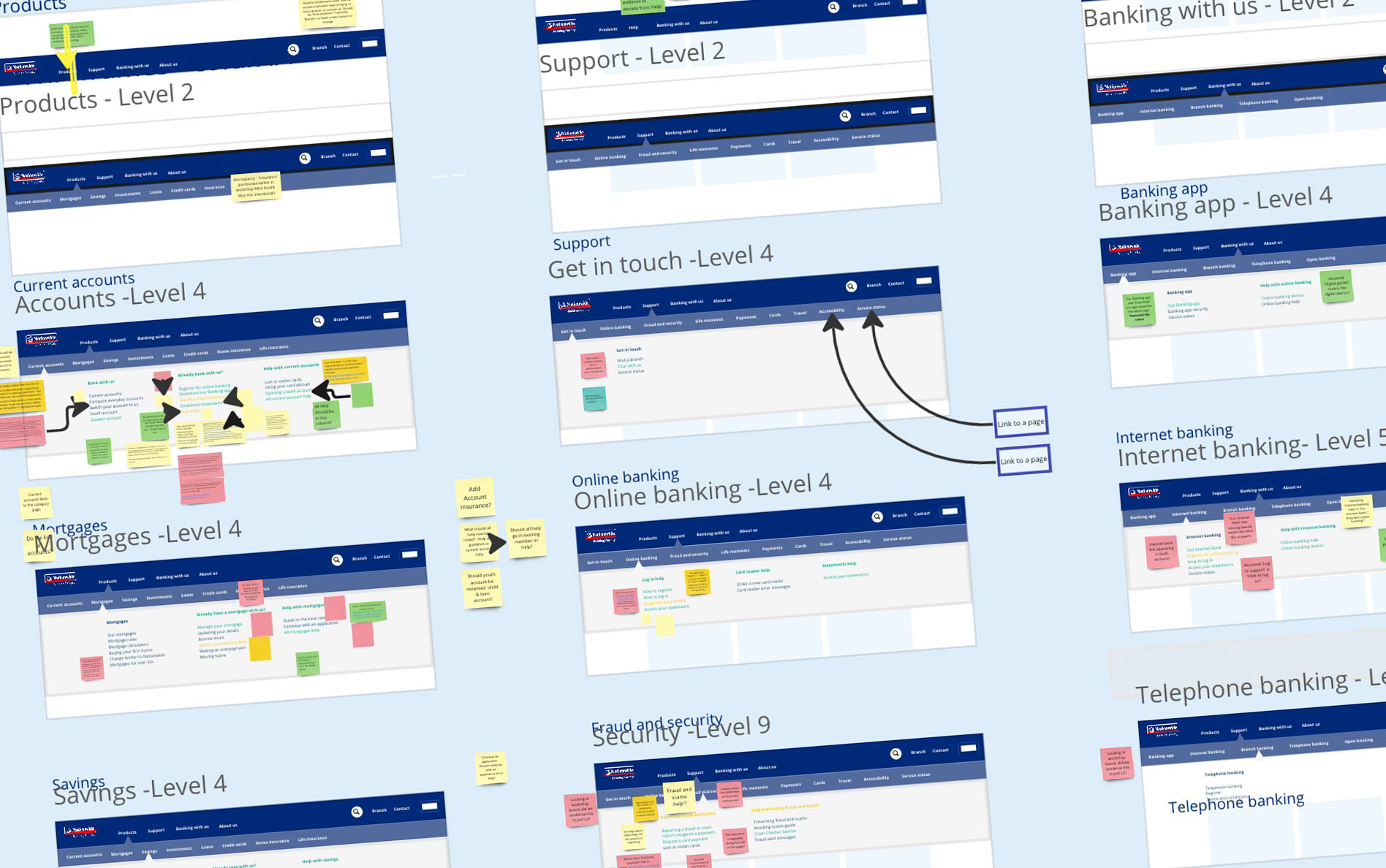
A large part of this work has been to understand how to re-structure the IA in the navigation. With over 700 pages on Nationwide, this was no mean feat. We engaged with content designers, UI designers, UX designers PO's and the wider teams responsible for the pages to ensure we understood their requirements and concerns on re-ordering and re-naming some of the pages. Tree testing We ran tree testing to determine how our navigation performs. Users were given 13 scenarios to test on our website. They were shown the text-only version of the menu of a website or app and then we asked them to locate information using just that menu.
Card sorting (new IA) - goals
We wanted to understand and discover:- Are our proposed top and sub level navigation labels categorised correctly?
- Do users identify and understand our new navigation labels?
- Does our information architecture match our users’ mental model?
- Are any of the labels problematic?
Better understanding
We set about speaking to product owners, content designers and UX designers to understand how users engage with our navigation IA and design if they complete the tasks successfully. Discover if this approach introduces any pain points. Discover if any of our terminology is confusing. We also wanted to find out of the UI causes any accessibility or usability problems.
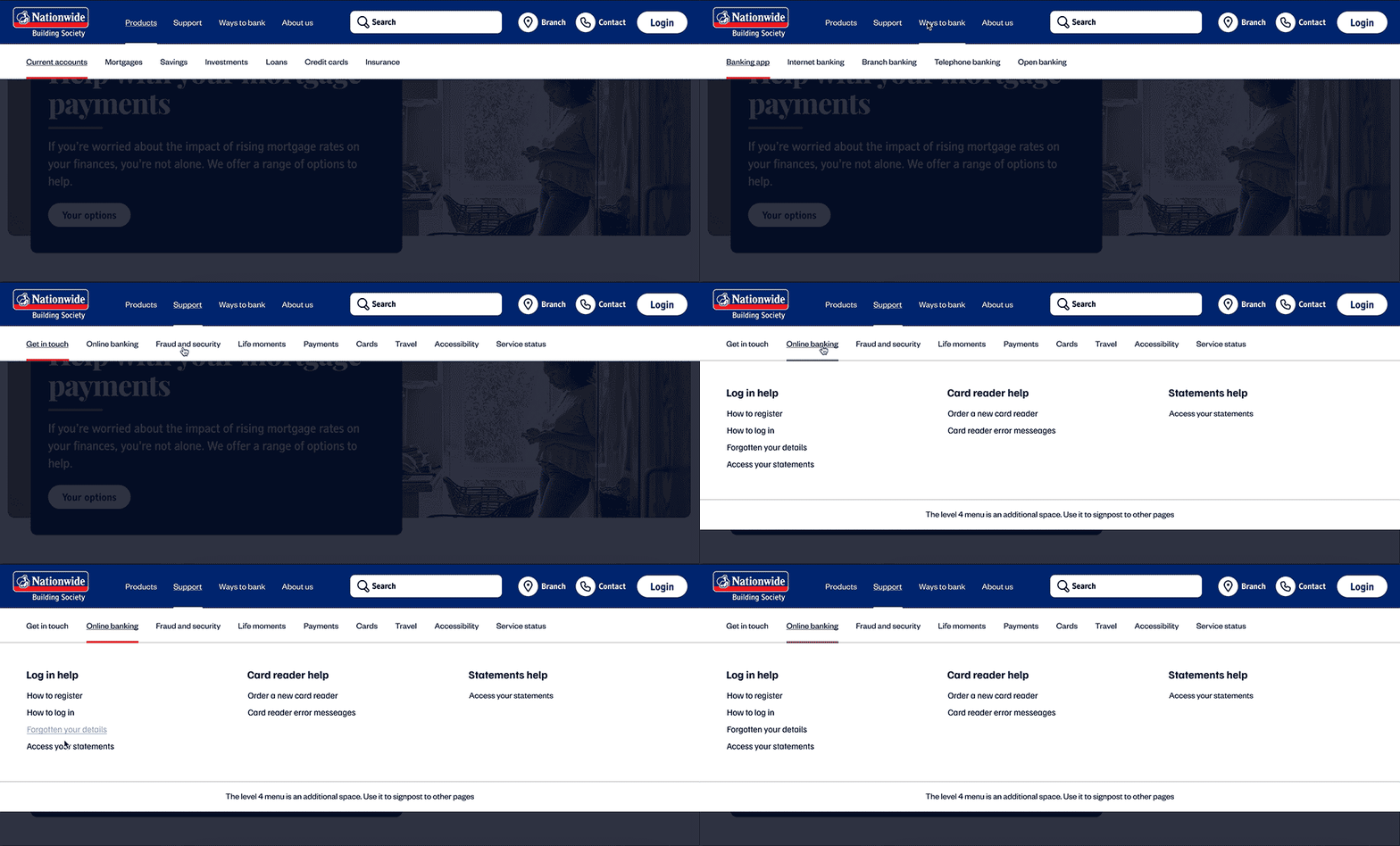
Prototype used for testing
The following layout was an initial layout prototype which we conducted user-testing (moderated) with 7 participants aged 26-68.
Our proposal for site navigation
Based on all our findings, we knew we wanted to shape our new navigation design on a full-width and tiered layout to help provide a cohesive and flexible solution. This would make the most of the screen real estate from 320 width up to high-definition screens and provide space to elevate marketing and signposting assets.
Production ready assets
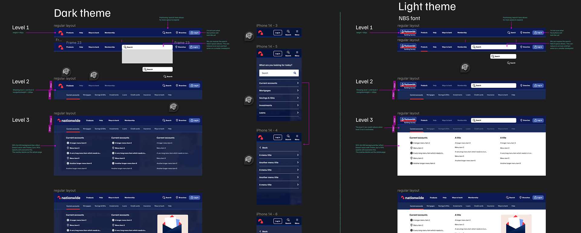
Once all data had been gathered from the team and users, I then set about to produce production ready assets in collaboration with developers. Developers were kept informed of all design decisions in the process of creating this work.

My Services
I am experienced working on web, platform & in multi-disciplinary teams
Web Design
- WCAG
- Accessibility
- Mobile-first
- Colour, hierarchy, typography & layout
- Best practice
- Insight and research
Mobile Applications
- Platform guidelines
- Style guides
- Iconography
- Layout
- User journeys
Graphic Design
- Branding
- Logo design
- Illustration and iconography
- Magazines, leaflets, books and all forms of printed literature
- Typography
Motion graphics
- Storyboarding
- Illustration
- Film
- Animatics
- Content creation
- Explainer videos
- Projection mapping
- Storytelling

Tim has delivered an exceptional body of work which was on time and on budget. We've really enjoyed working together and look forward to collaborating on any new projects together!
— Hanna Ager

I enjoy working with Tim to kick-start projects, ideate and work through from end-to-end journeys. He's a dedicated, hard-working designer who clearly loves what he does and will always knock our expectations 'out of the park!'
— Chris Davies
