kallidus design system
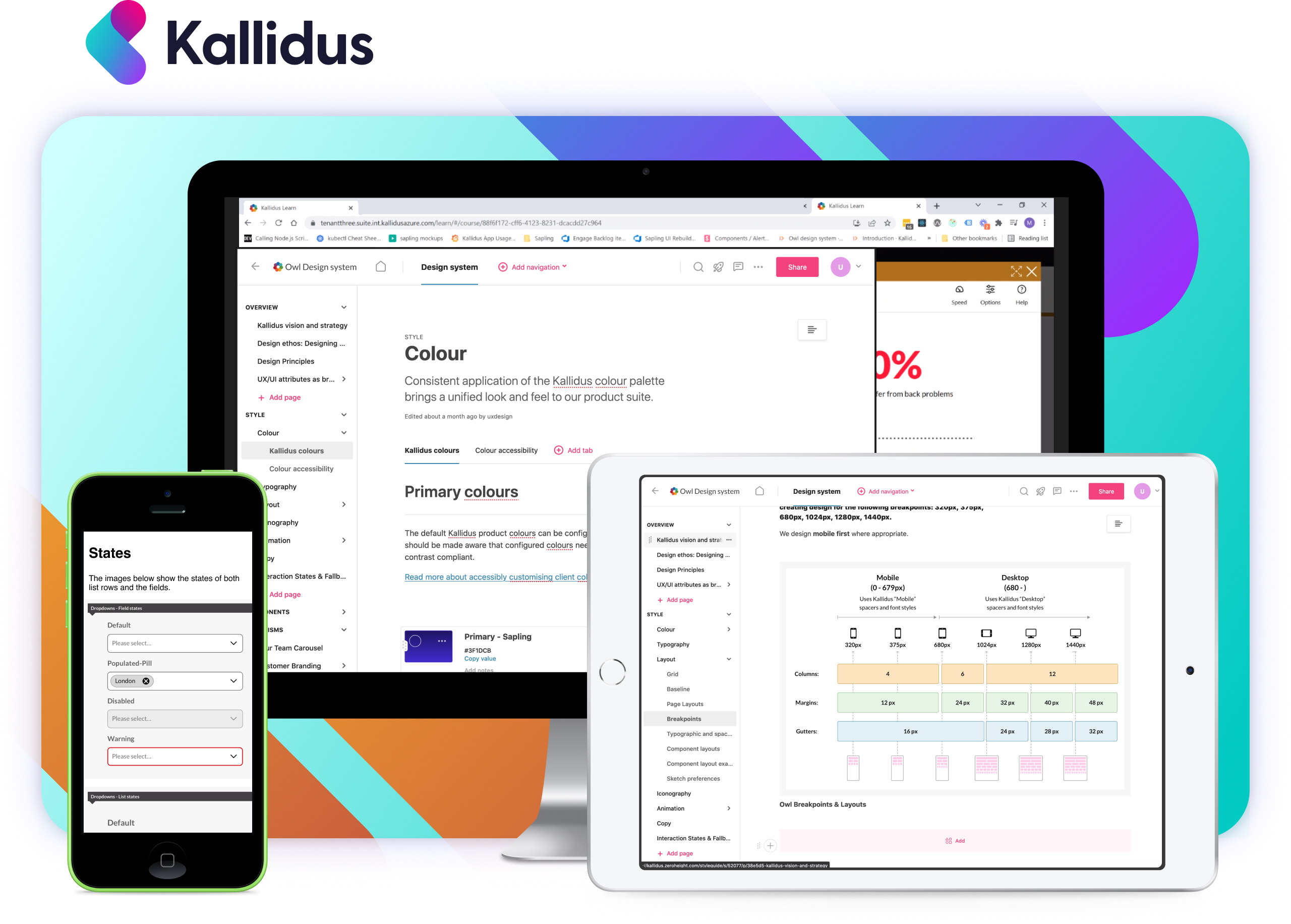
During my time at kallidus – a human capital management service, I have been heavily involved in creating and utilizing a collection of repeatable components based on Atomic Design accompanied with a comprehensive online style guide. By developing this SaaS design system we have been able to change the pace of creation and innovation across the company in prototyping, interaction, user interface and development.
5 minute read
Design system
UX/UI
Kallidus offers the following products which make up the Human Capital Management product:Learn, Recruit, Sapling HR, Engage and Perform.
The design system was created to support all digital products kallidus has on offer. This was rolled out in 2022 internally and to all customers.
What I did
- Research
- Project management
- Product development
- Prototyping
- Asset creating
- UX/UI
- Stakeholder management
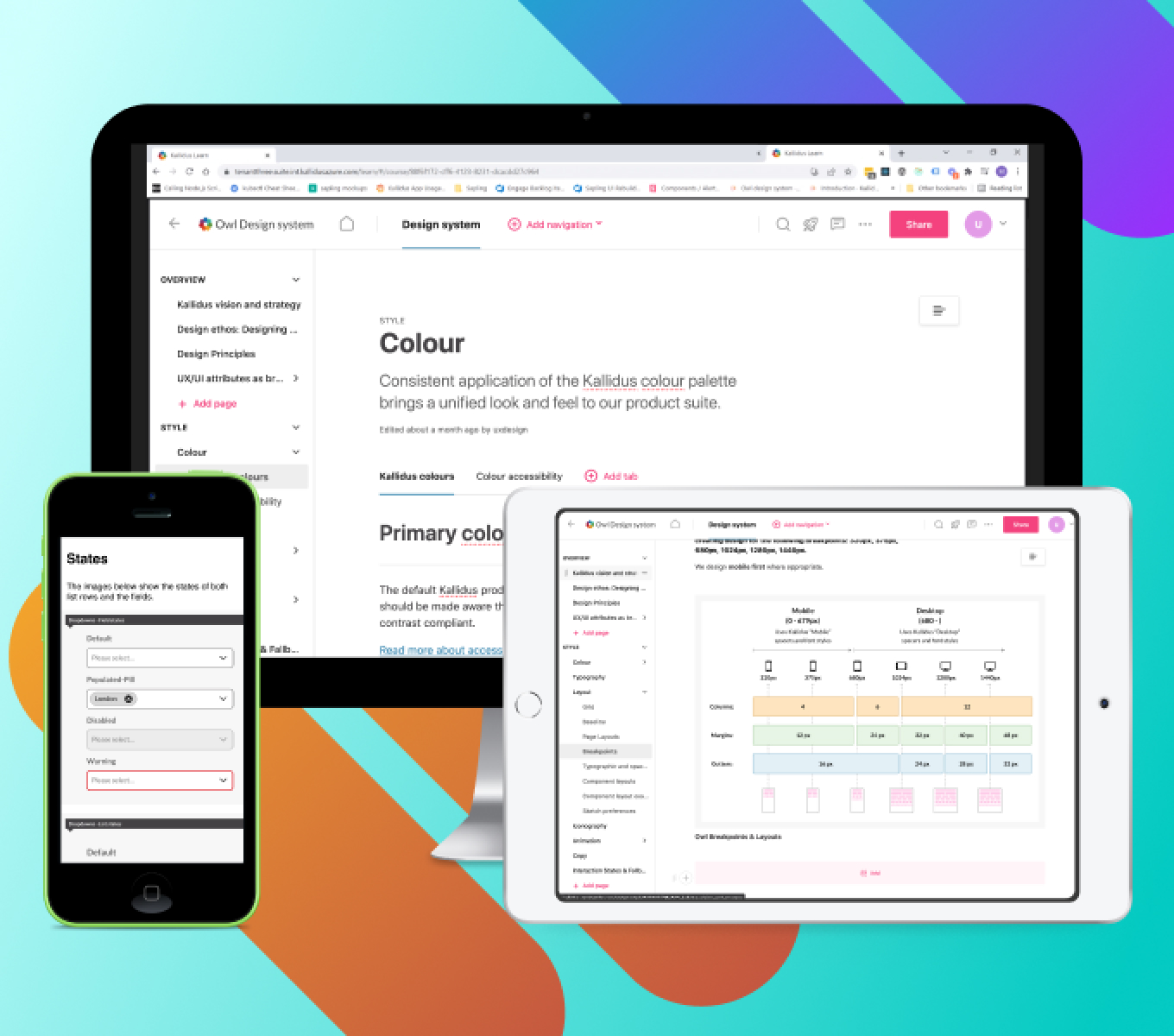
This example (below) captures some of the key screens written up in the online style guide, Zero-height.
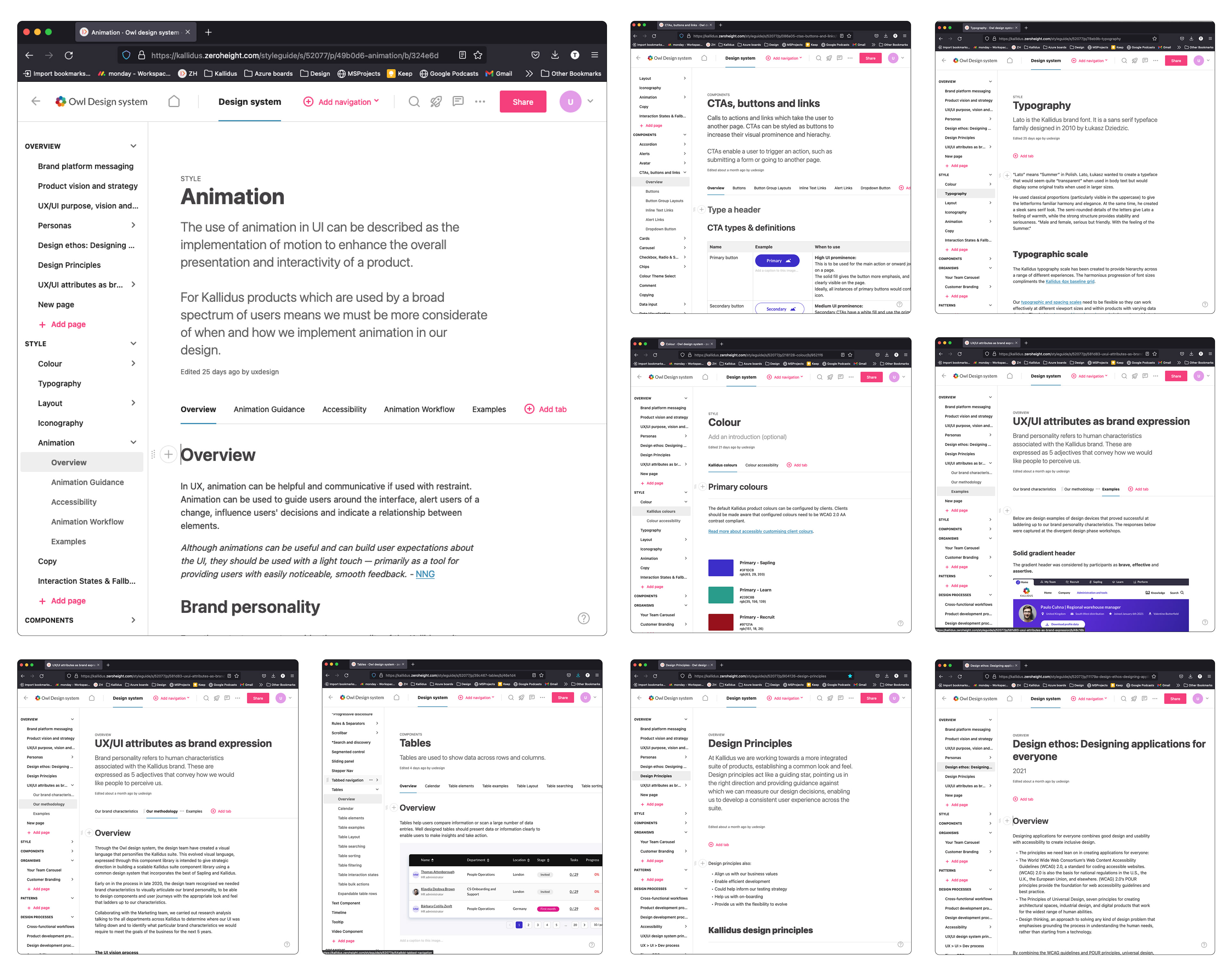
Establishing design principles
Before researching or generating any kind of design, it's crucial to understand the 'pillars' which guide the design process within the UX/UI team. These design principles which align to the business goals were already part of our workflow but it needed more direction in terms of design qualities.
These design qualities include:
These articulate how our design principles should manifest within our products. The design qualities helped define the decision making throughout the process of creating new assets and page views for products in the system. To understand what design qualities clearly capture the brand, I set about conducting a series of interviews (quantitative) and surveys (qualitative) with employees and customers on the existing product and captured their response in the form of affinity mapping to visualise themes.
A new 'off the shelf' design system
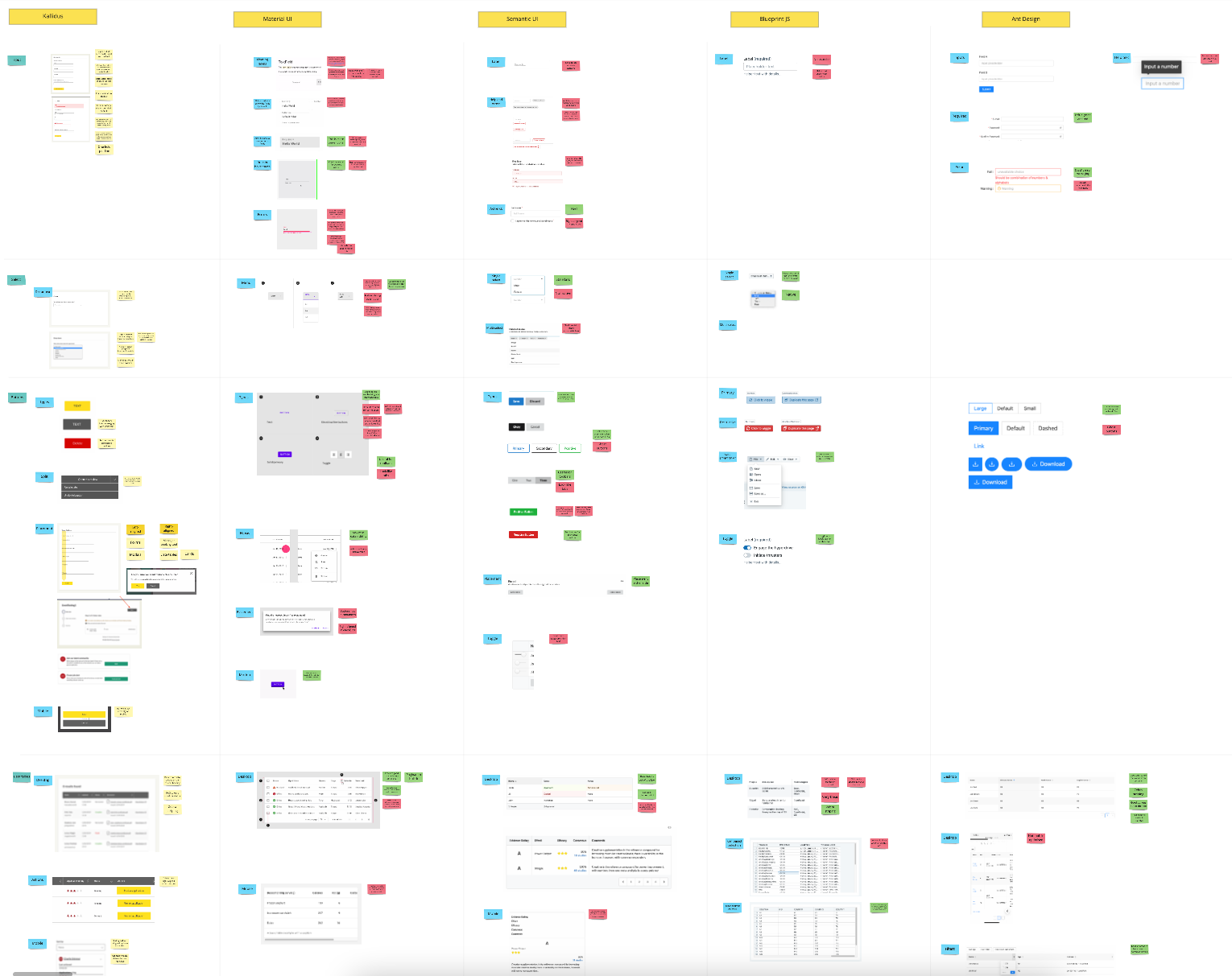
When creating a new design system, it became clear from a design to development point of view there are many existing and free design systems which can be used from the outset. We carefully selected one of these design systems with the intention to use it as a 'backbone' to creating our own customised version. Between the design and development teams, we fed back on the pros and cons of certain design systems and presented back to the CTO and stakeholders the results. The final design system uses elements of the off the shelf design system – with significant modifcations made to it.
A MIRO board exploring the positive and negative aspects of established design systems: Material design, Blueprint JS, Semantic UI, Ant Design.
From the sales, customer and employee feedback, the team were looking for a new direction to take the products visual design. We began looking at similar and altogether different products to look at interesting visual elements, nice interactions and any other things we thought could be good to include in our conversation on how the product could evolve as a SaaS product.
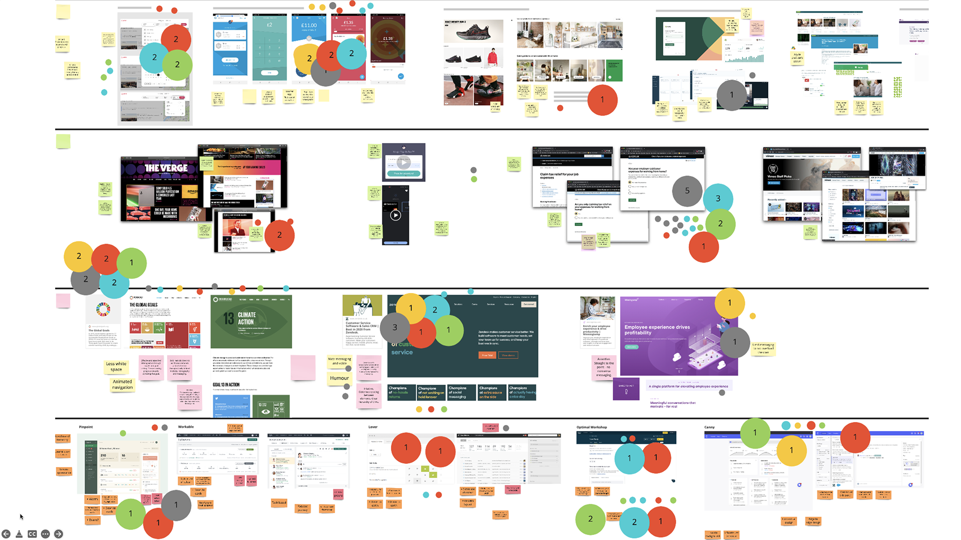
I set about inviting the design team to leave comments and colour dot-voting the areas of interest which they felt were the most successful. Based upon the number of votes, we reduced the number of areas of interest which best align to our design qualities though affinity mapping.
Design ideation
We were now ready to create some visuals based on all the feedback gathered along with the guiding design principles and design qualities. These new concepts would continue to be placed in front of users and colleagues along the design process.
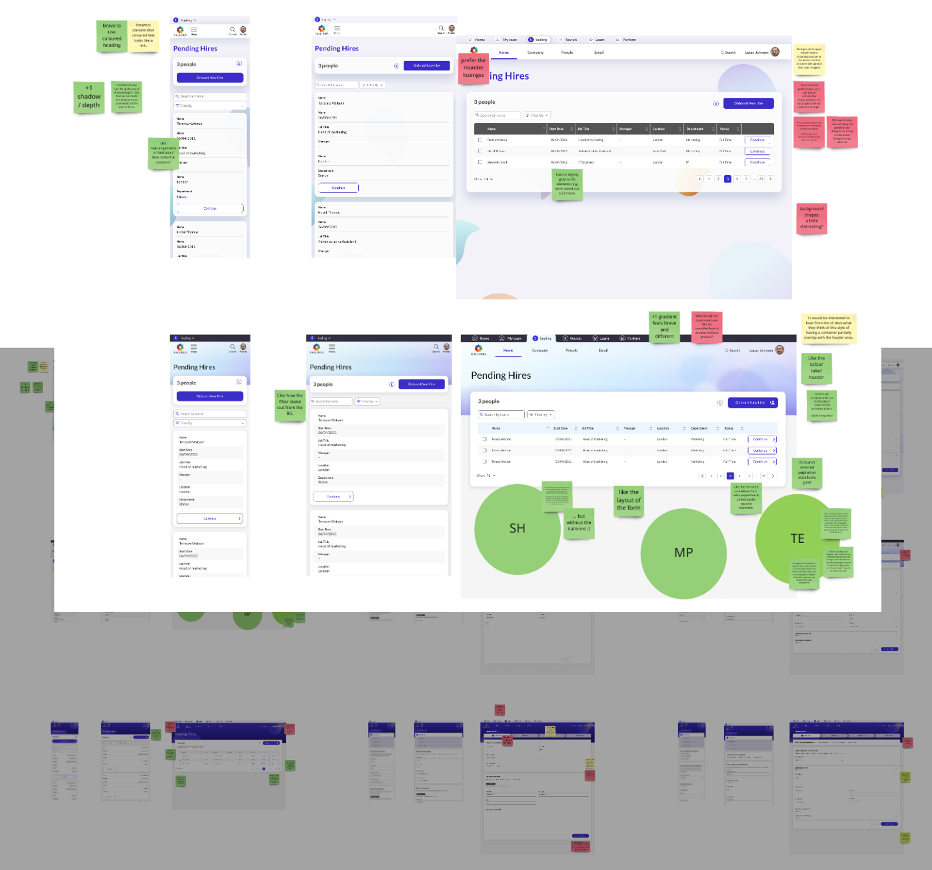
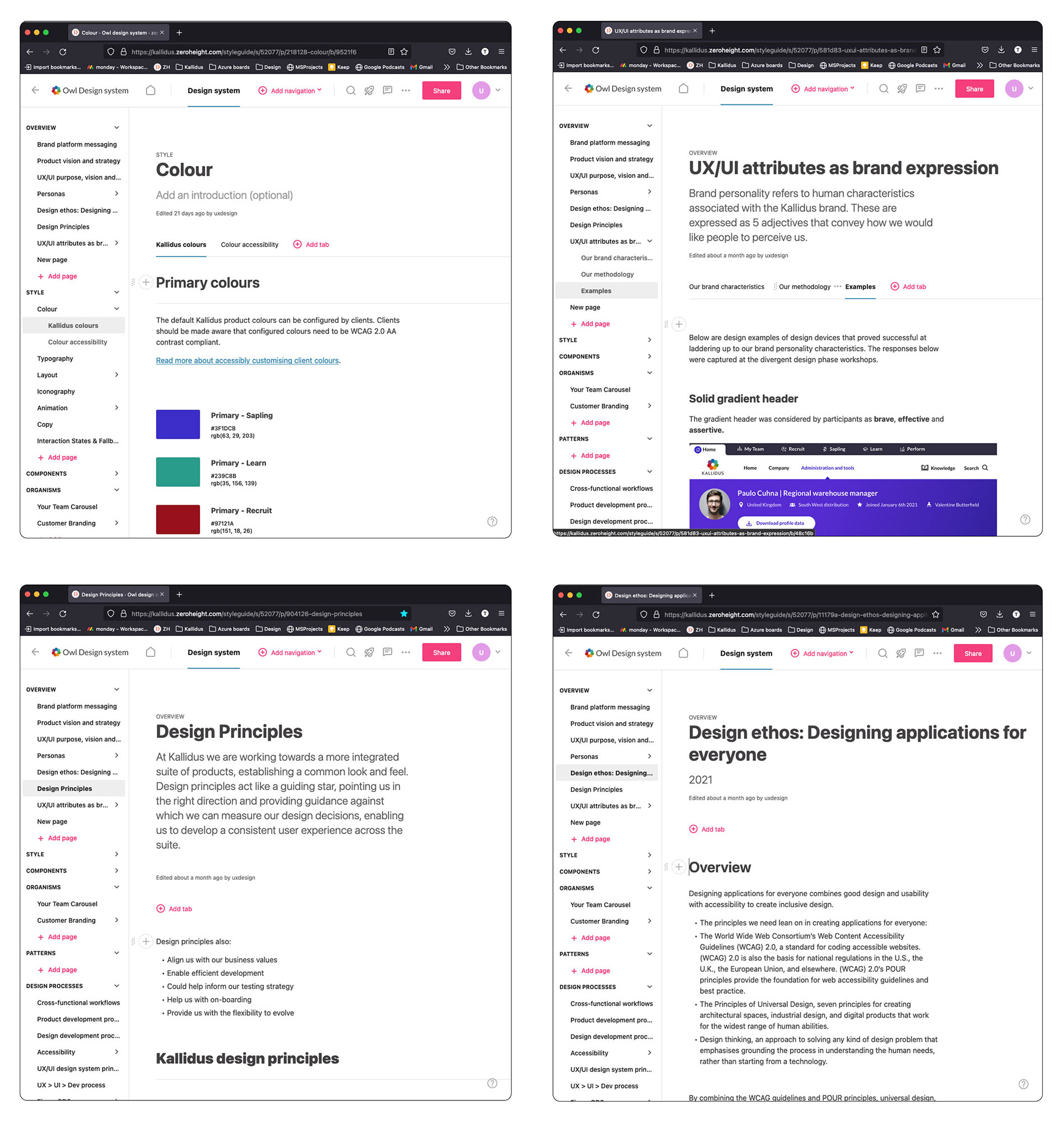
I built these in Figma and created rationale in Zeroheight (an online style-guide). I set about creating the overview and style section which speaks about hierarchy, colour, typography, layout, iconography, animation, copy and interaction states and fallback colours.
digital products kallidus has on offer.
This was rolled out in 2022.
The types of components created within the design system can be split out into the following categories:
Accordion, alerts, avatar, CTAs, cards, carousel, checkbox-radio and switches, chips, colour theme select, comment, copying, data input, data visualisation, date-picker, drag and drop, dropdown, error, filtering, from sign off, image, image upload, lists, loading, modals, navigation, notifications, org chart, page footer, pagination, pop-over menu, rules and seperator, scrollbar, search, segmented control, sliding panel, stepper nav, tabbed navigation, tables, text component, timeline, tooltip and video component. Phew!
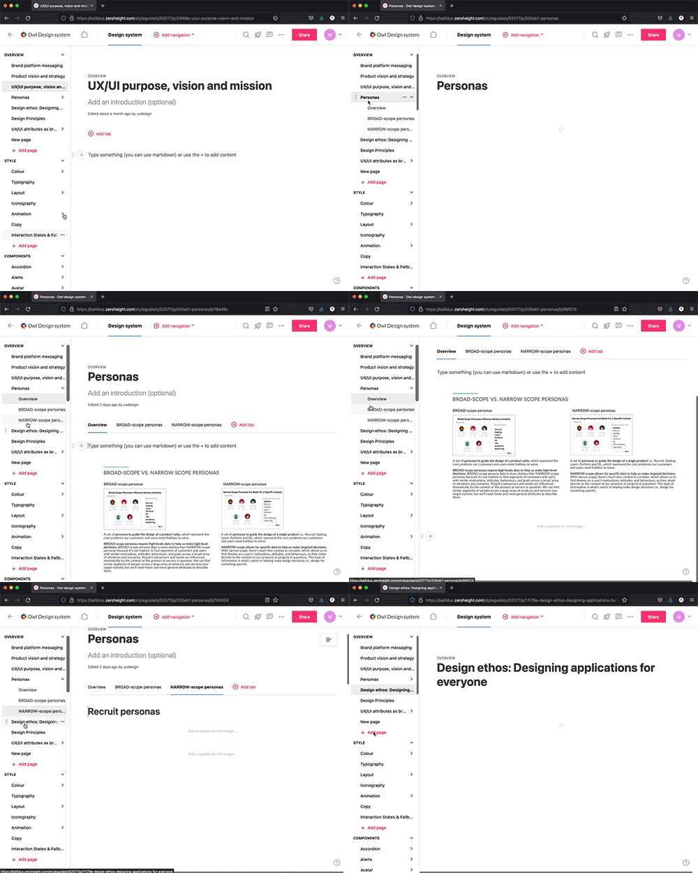
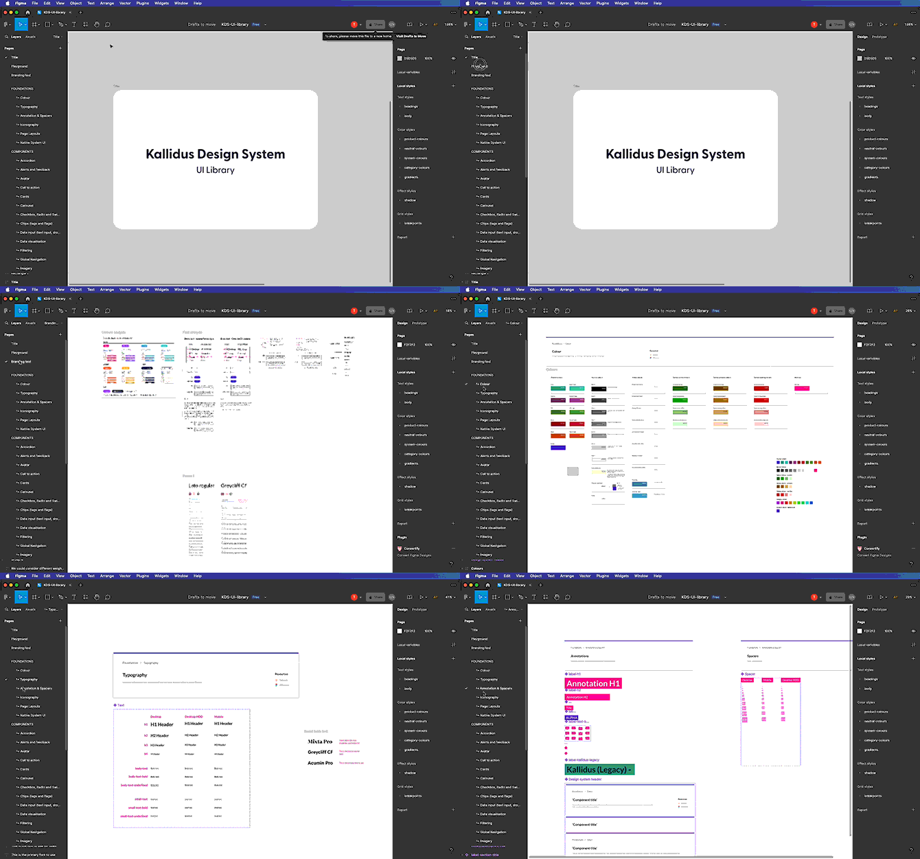
Above (left)are some example pages which explain why and how to use the component. This information aims to be high level so it can provide guidance to development on when it's appropriate to use its relationship to other components. It also provides examples of states, animations, colours, typography and do's and dont's. Right, is the accompanying Figma file (work in progress).
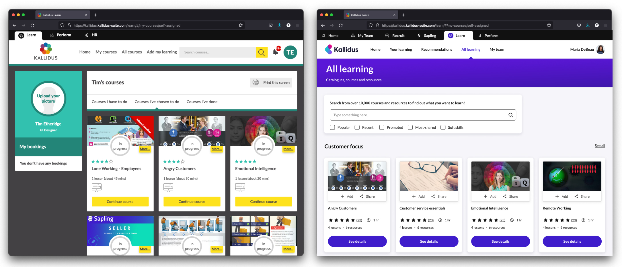
The 'Learn' product before and after the design system was applied
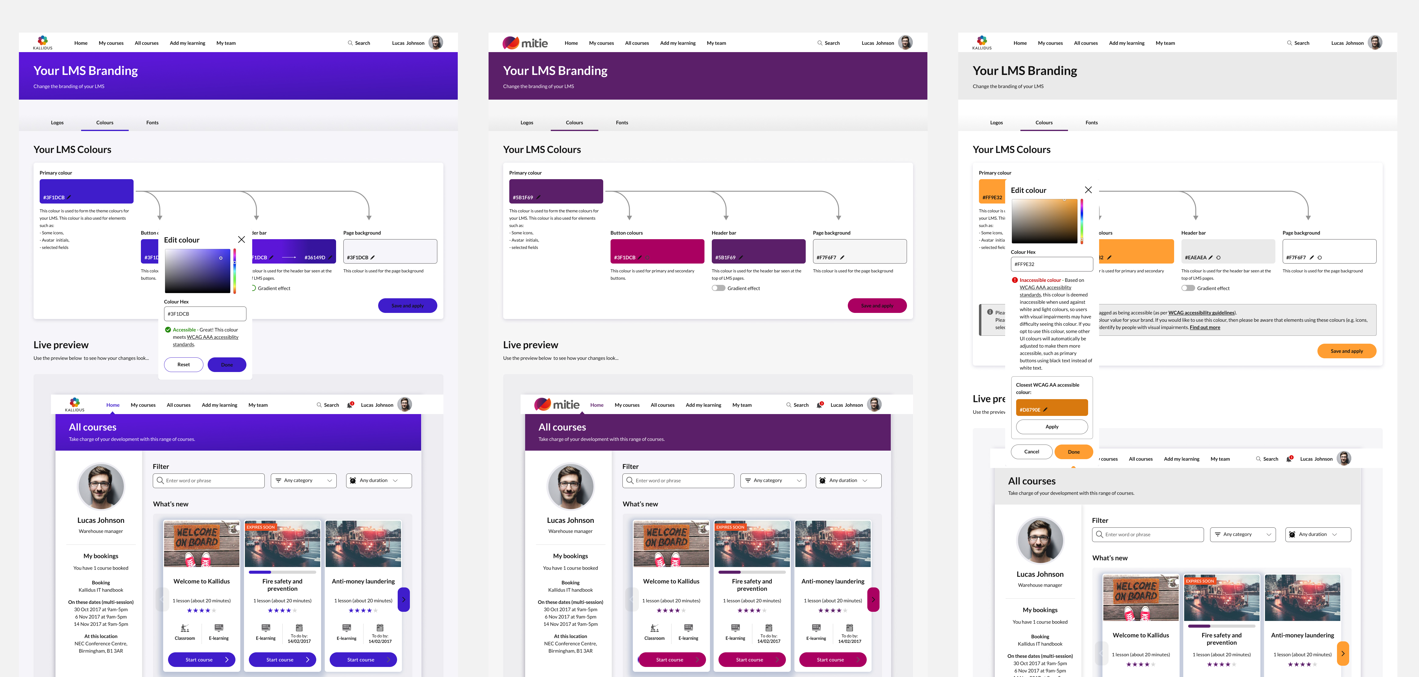
An example of the 'Learn' product with re-branding applied from the 'back-end'
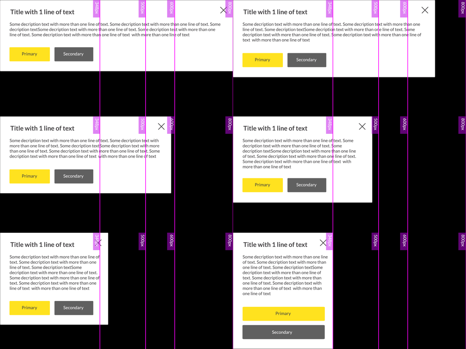
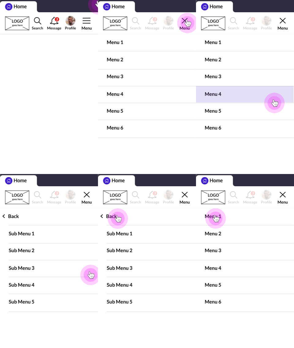
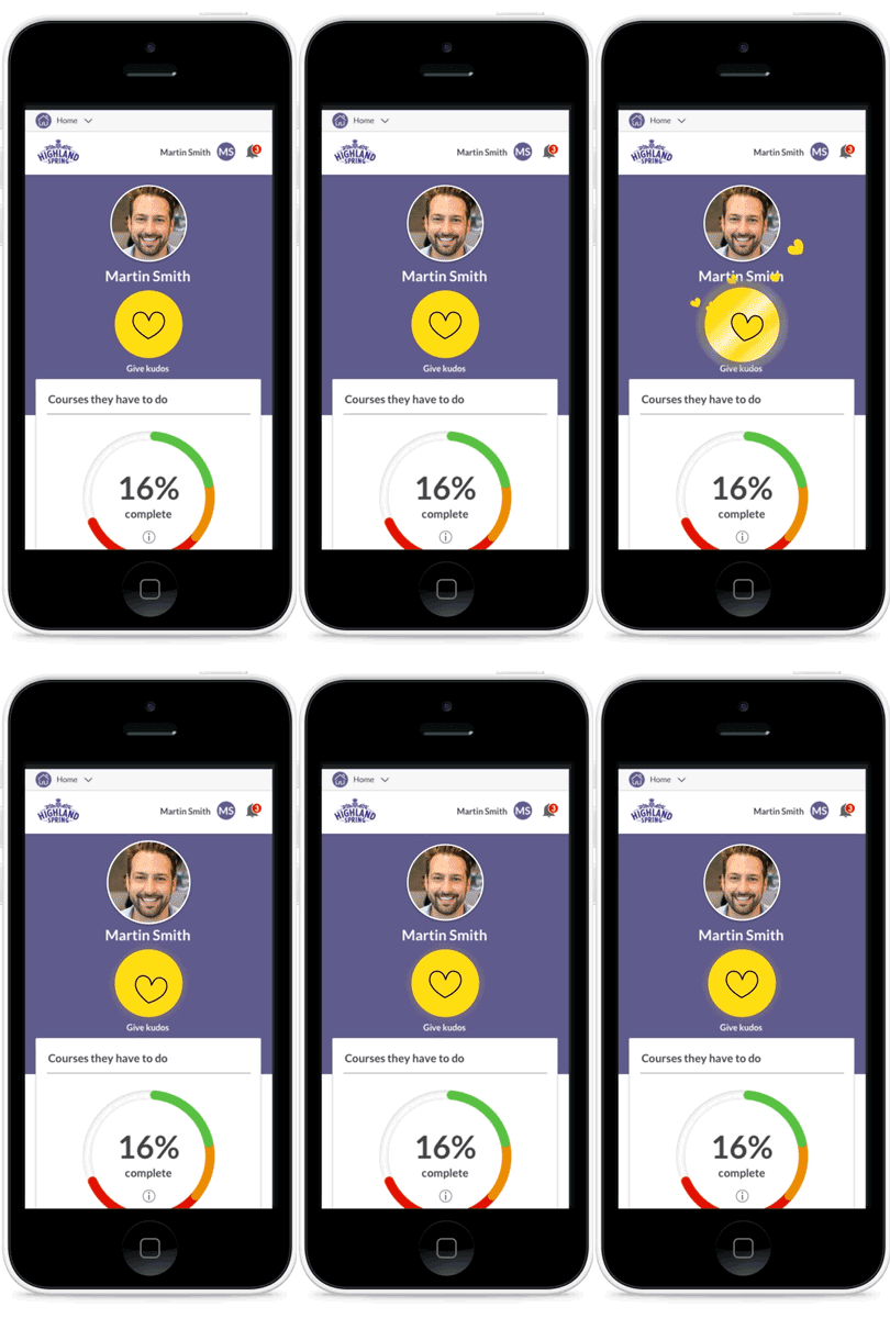
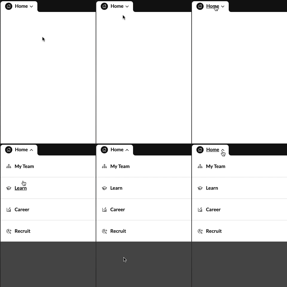
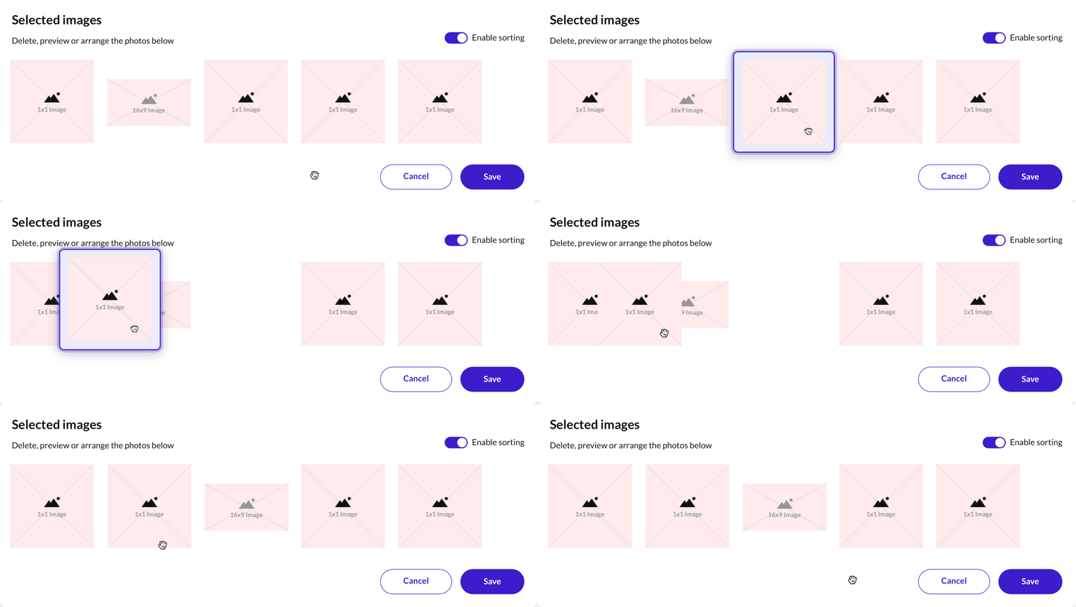
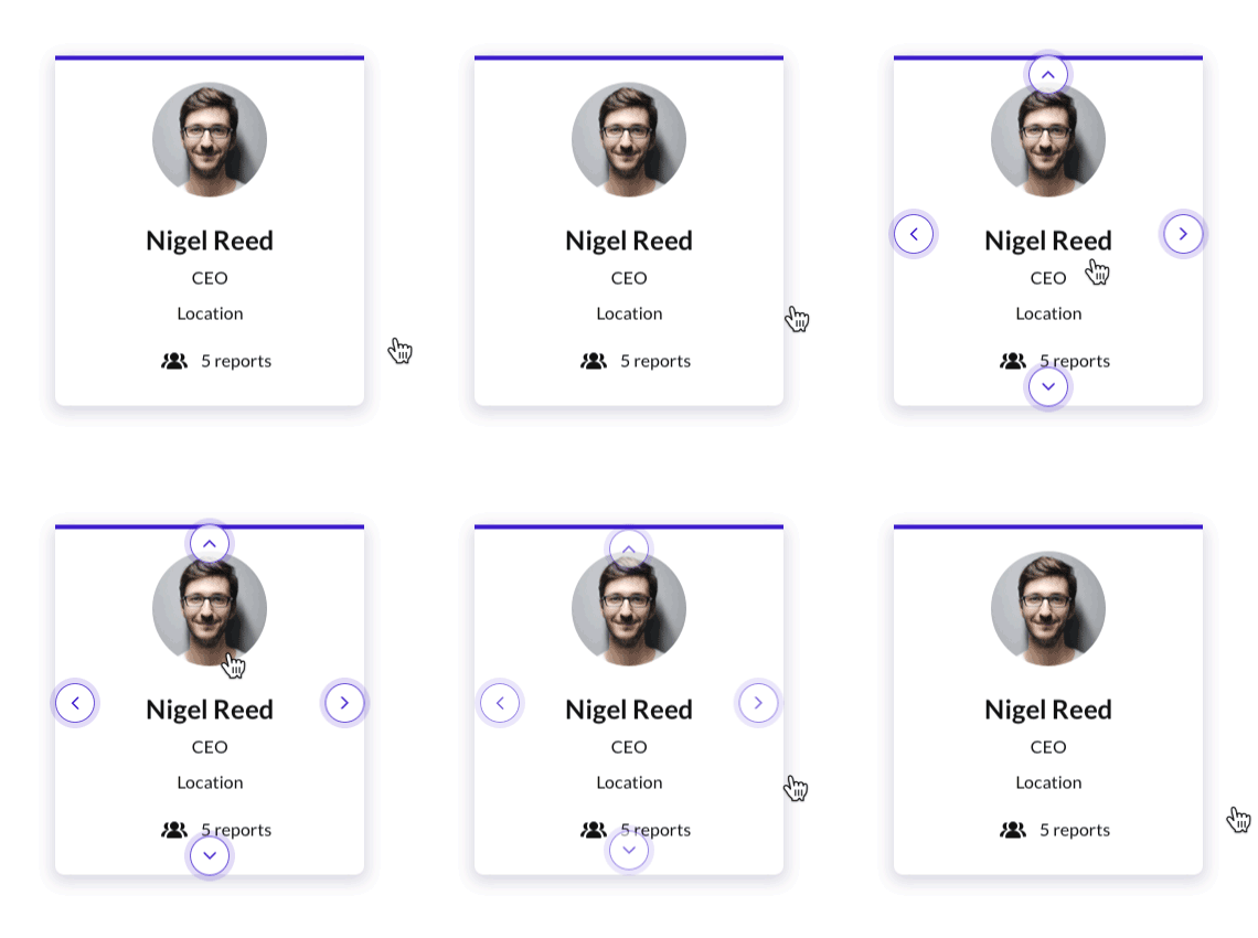
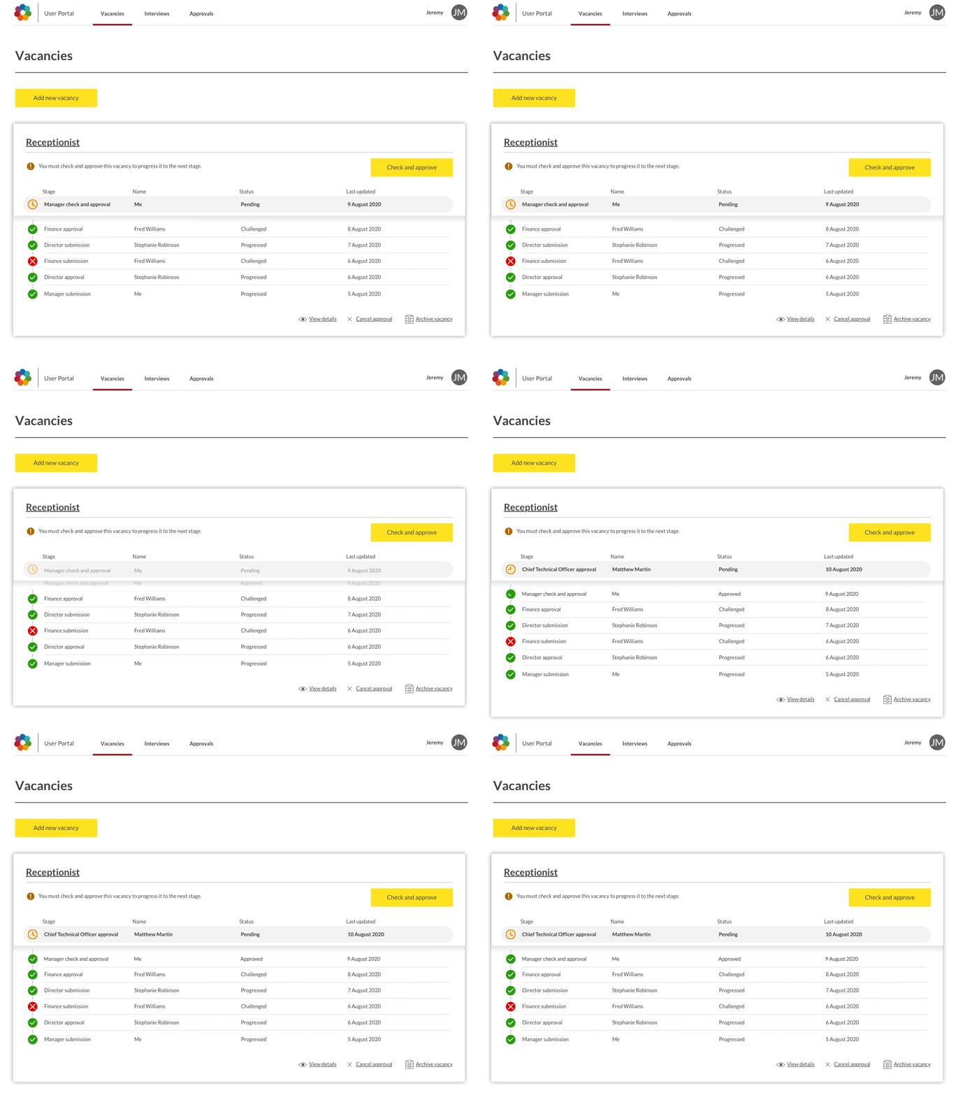
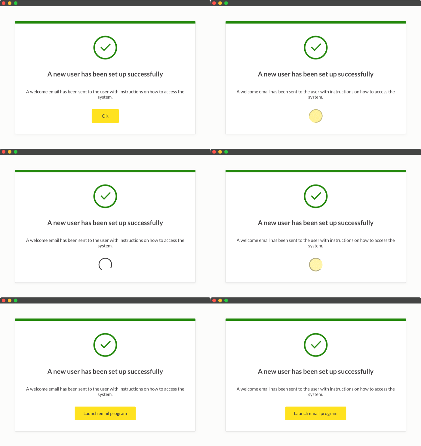
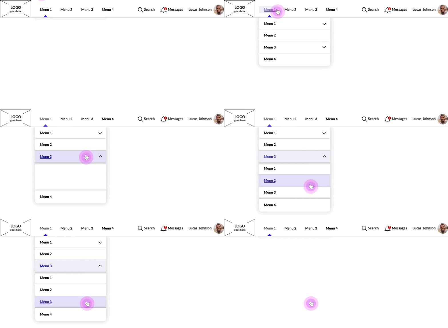
Interactions provided for production
The following interactions were provided as part of handing over timings to developers - as well as assets for the online styleguide.


My Services
I am experienced working on web, platform & in multi-disciplinary teams
Web Design
- WCAG
- Accessibility
- Mobile-first
- Colour, hierarchy, typography & layout
- Best practice
- Insight and research
Mobile Applications
- Platform guidelines
- Style guides
- Iconography
- Layout
- User journeys
Graphic Design
- Branding
- Logo design
- Illustration and iconography
- Magazines, leaflets, books and all forms of printed literature
- Typography
Motion graphics
- Storyboarding
- Illustration
- Film
- Animatics
- Content creation
- Explainer videos
- Projection mapping
- Storytelling

Tim has delivered an exceptional body of work which was on time and on budget. We've really enjoyed working together and look forward to collaborating on any new projects together!
— Hanna Ager

I enjoy working with Tim to kick-start projects, ideate and work through from end-to-end journeys. He's a dedicated, hard-working designer who clearly loves what he does and will always knock our expectations 'out of the park!'
— Chris Davies
