Kallidus eLearning player
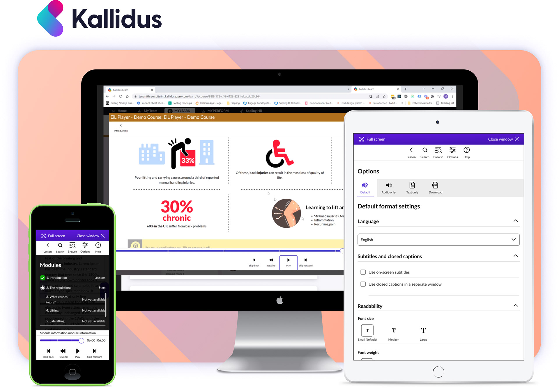
As design lead, I have had opportunity to work in many parts of the business and products. One key project to highlight is the Engage in learning player (EIL). This player sits within the Learn product (Learn Management Software - LMS) – or any other 3rd party LMS. This online player allows users to watch courses on a wide variety of content – from health and safety to leadership management. There is a diverse and comprehensive set of content – all of which adheres to SCORM and WCAG accessibility standards – as well as working in a SaaS environment.
Kallidus
EIL (SCORM) player
What I did
After doing some initial research from speaking to customers, looking through Zendesk comments and reaching out to stakeholders, it was clear the EIL player was falling far short of the experience Kallidus knew it could deliver.
- Concepting
- User interface
- User journey/wireframing
- Prototyping
- Testing
- Production
- Stakeholder management
The business goal was to increase customer subscriptions by 12% after the re-design - something which we felt was achievable if we truly understood customer needs and experience when using the product.
https://www.kallidus.com/product/off-the-shelf-courses
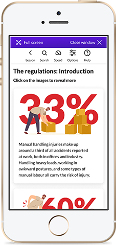
Make it mobile friendly!
Based on customer feedback, the business required a complete re-design of the EIL player and its content to enable users to access its content as a mobile-first product. The EIL player was originally designed as a desktop-only experience and didn't accommodate customer needs and requirements which are necessary for today's dynamic workforce.
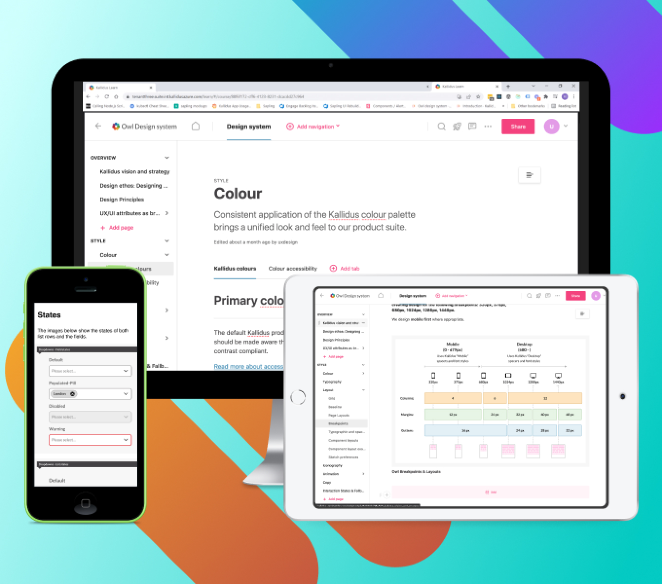
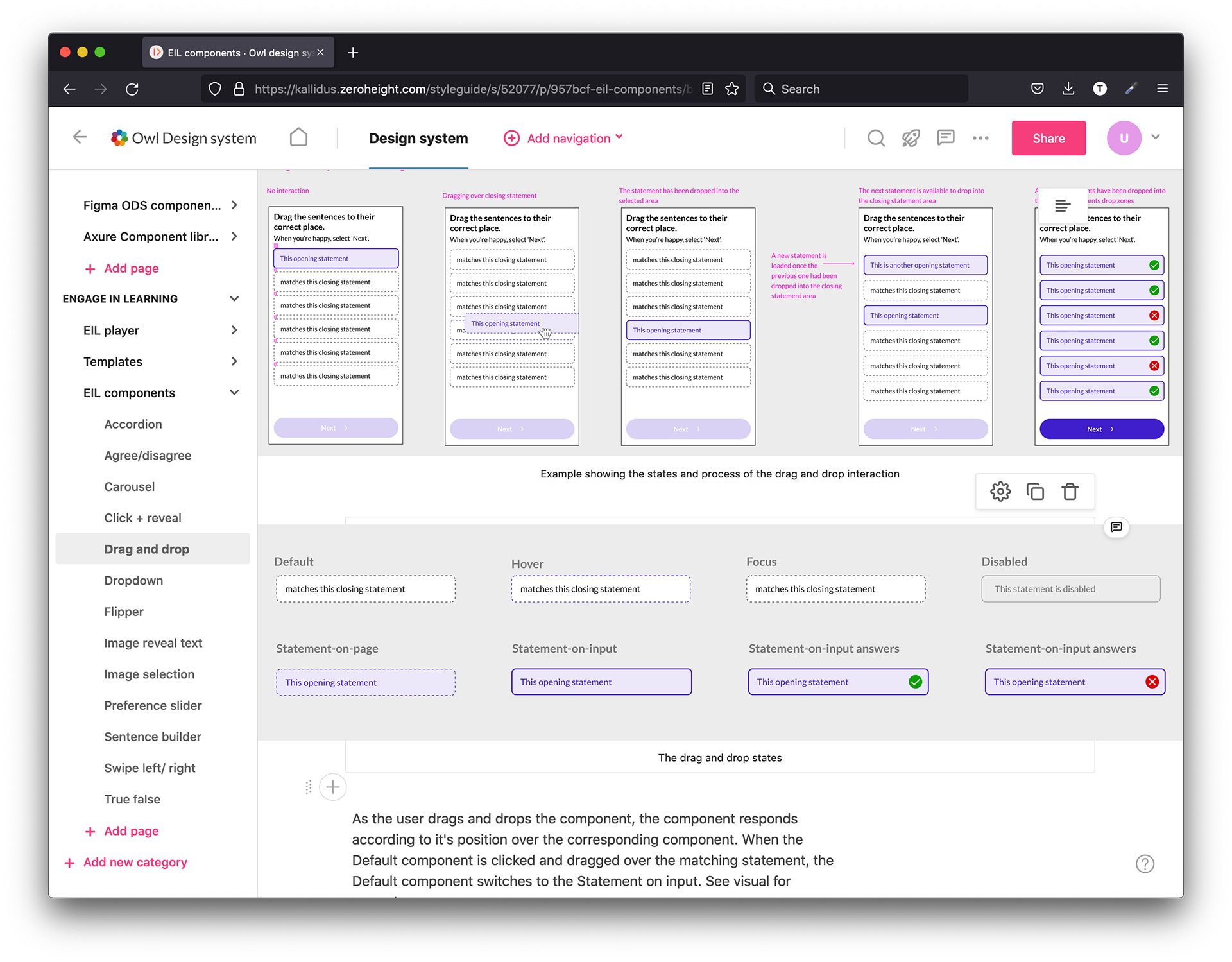
The company has several other products which are being rolled out to use the Design System - recently developed in-house by a small number of UI designers (including myself). The Design System uses Zeroheight (online style-guide) and Figma (to create and inspect components), Storybook and Azure. We previously used Sketch and Zeplin but have now streamlined the digital products into these pieces of software for the development process. The EIL player needed to use this Design System for key screens within the player content as well as keeping the original charm of the EIL content course material. These included items such as illustrations, animations and use of colour – to name a few.
Make it 'on brand' and engaging!
Kallidus had an evolving design system - but the player wasn't part of the original design thinking. We set about understanding what percentage should look like existing design system components and what should be stand-alone elements unique to the player.
Based upon the business goals, analysis of the existing player and best practice we went about creating a new set of screens which provided a better user experience
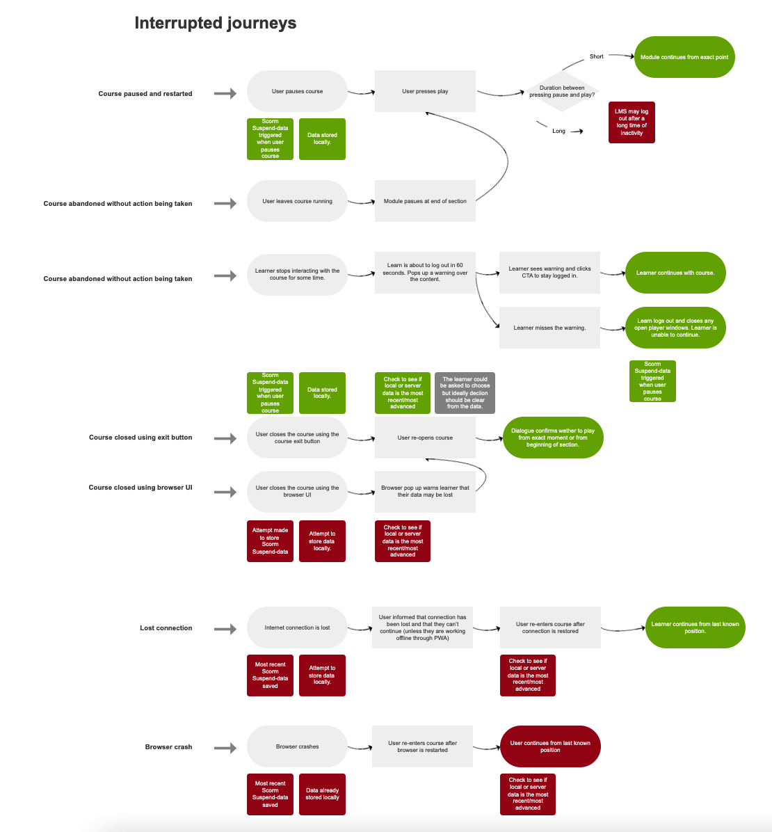
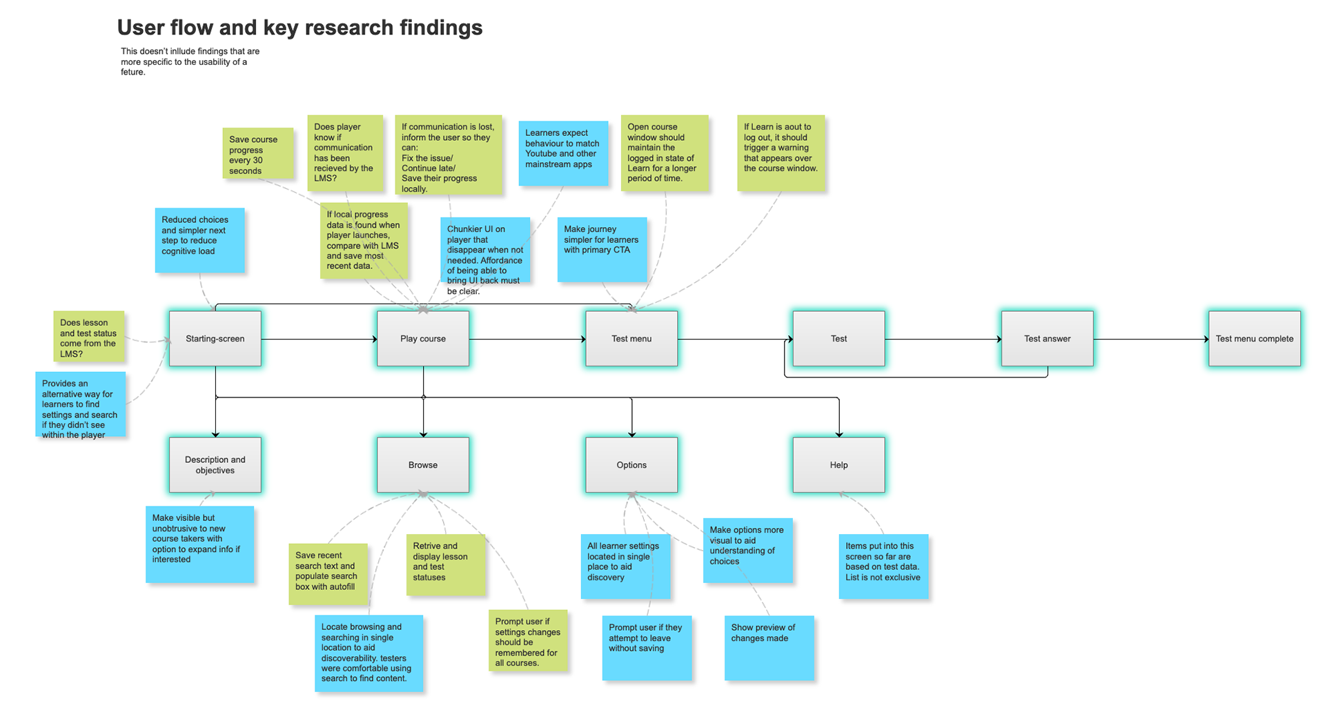
The Design System showing some of the player components
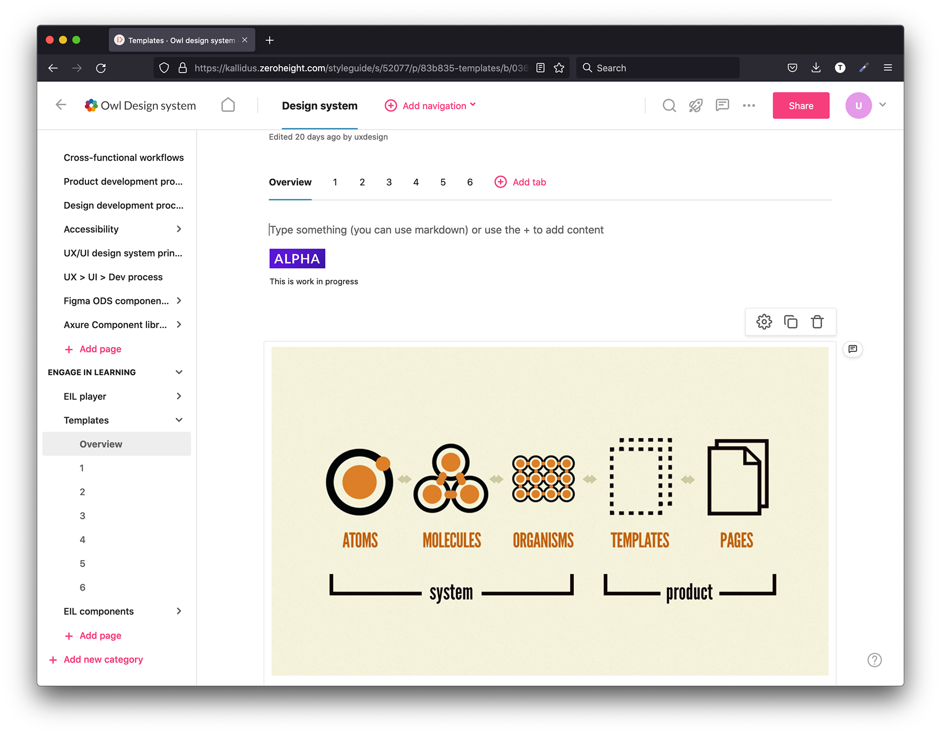
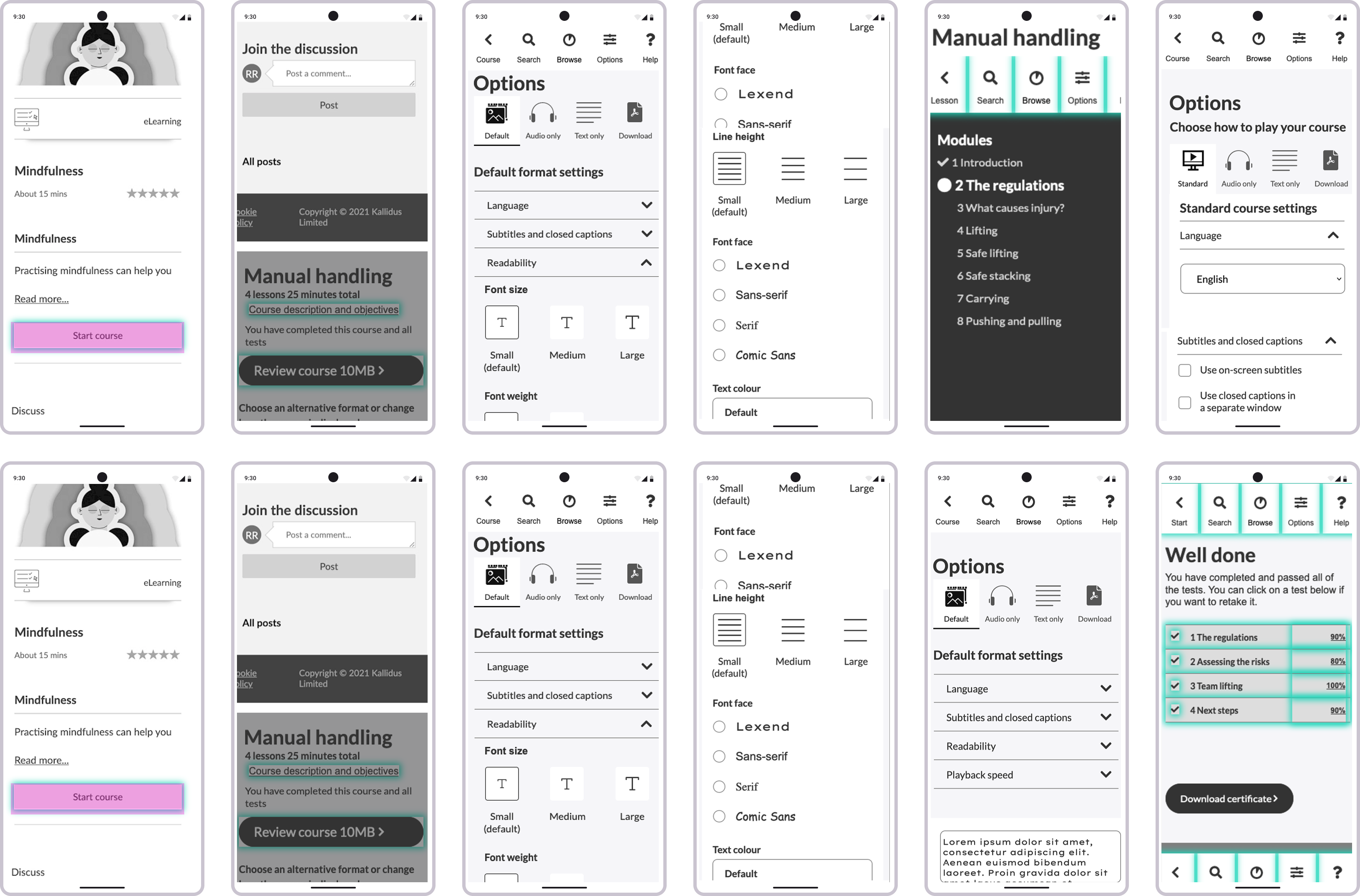
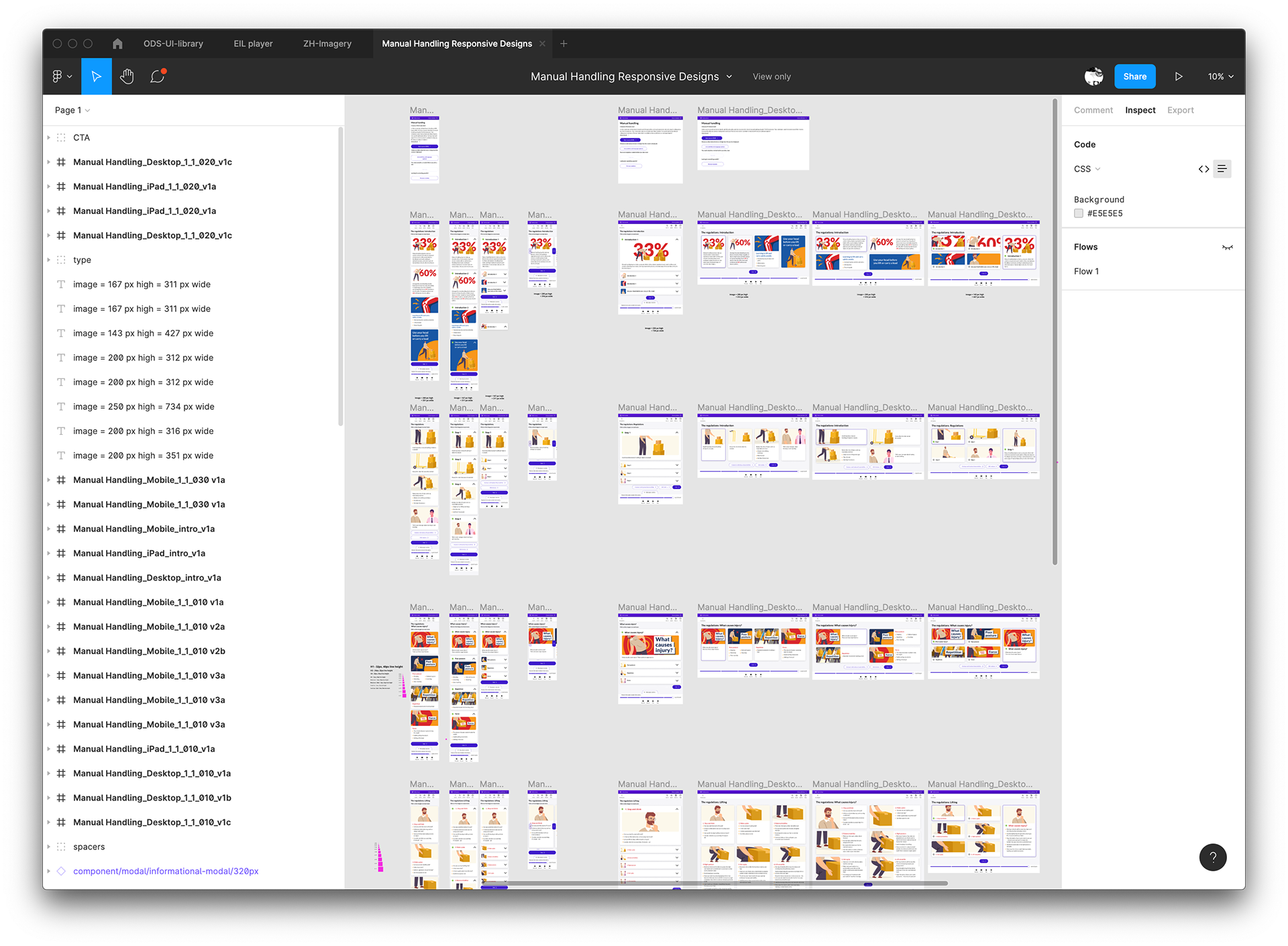
It was decided to use one of the existing courses to make mobile friendly.
We also re-designed the content so it would flow better across the breakpoints.
To overcome some of the additional requirements of the the player, the player was developed as a 'fork' of the Design System and the components were only to be used within the EIL player content and nowhere else within the Design System.
This design system was built to adhere to WCAG and accessibility guidelines. It was also built to work as a SaaS product so customers could change the colours and some of the identity to work alongside their brand. The EIL player content had many unique challenges to keep to this standard. The player, in it's nature is a time-based product which needed further consideration around timings, course material colours and typography, screen format (16:9 ratio and portrait format).
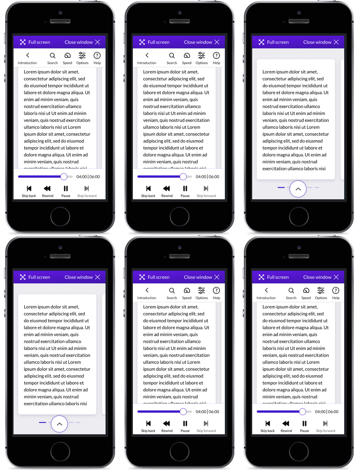
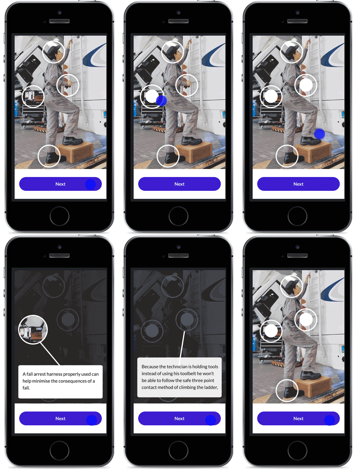
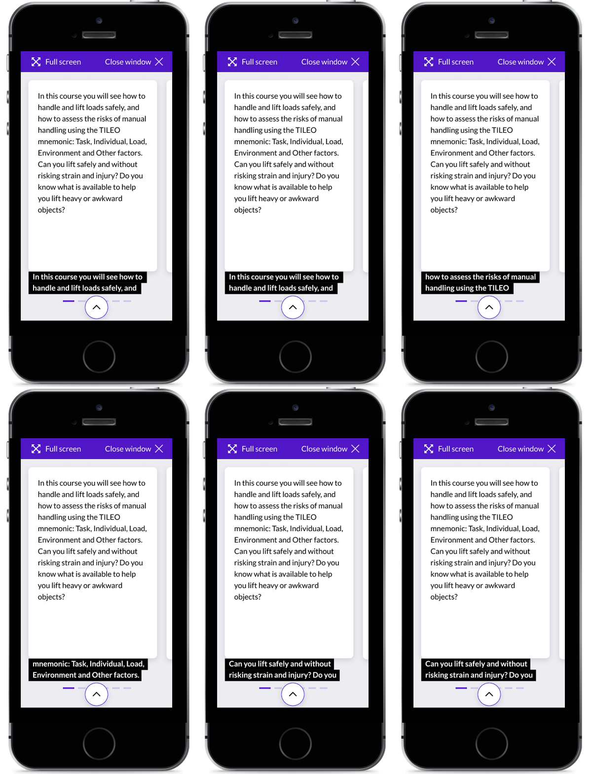
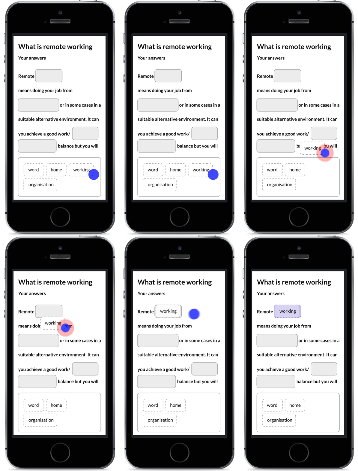
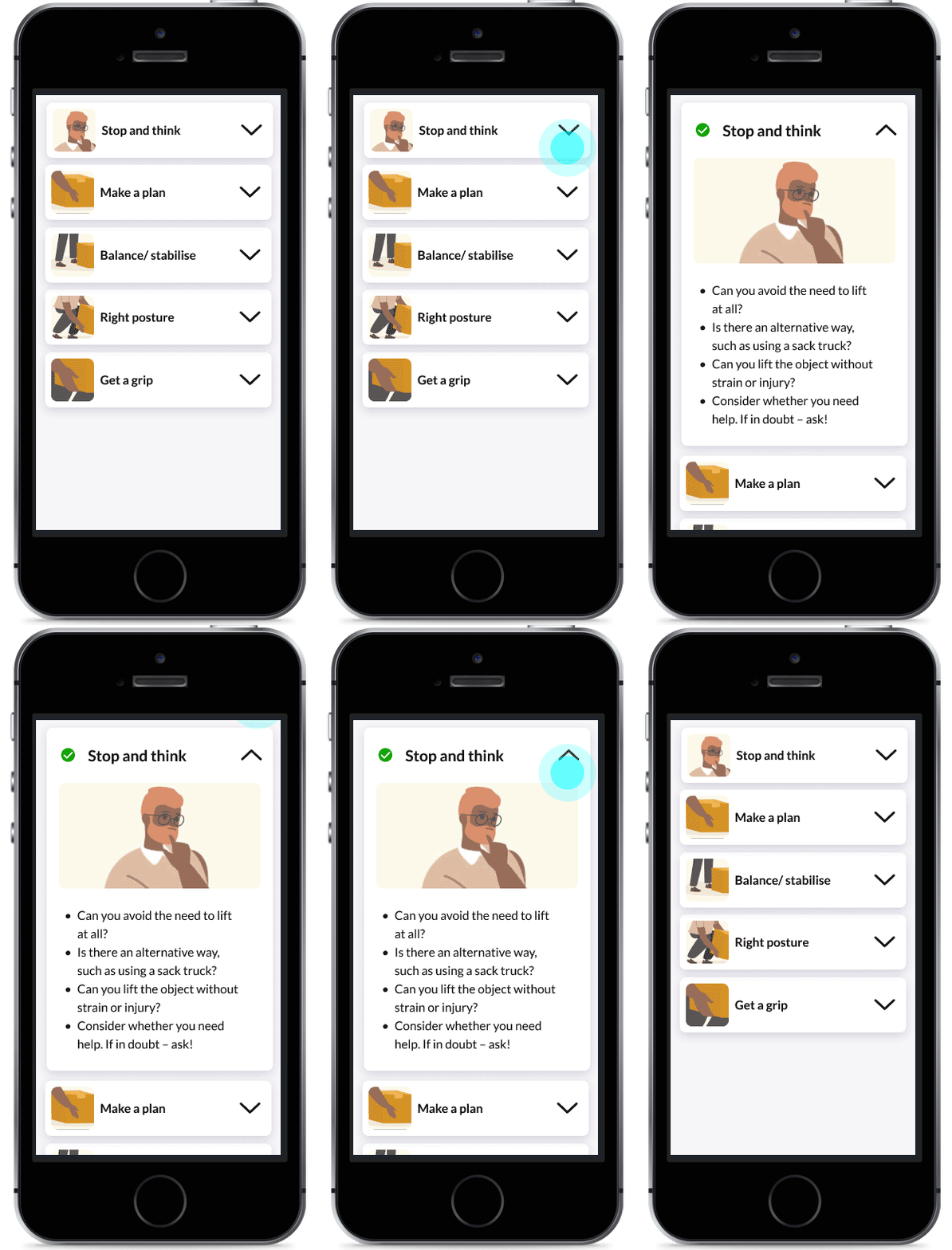
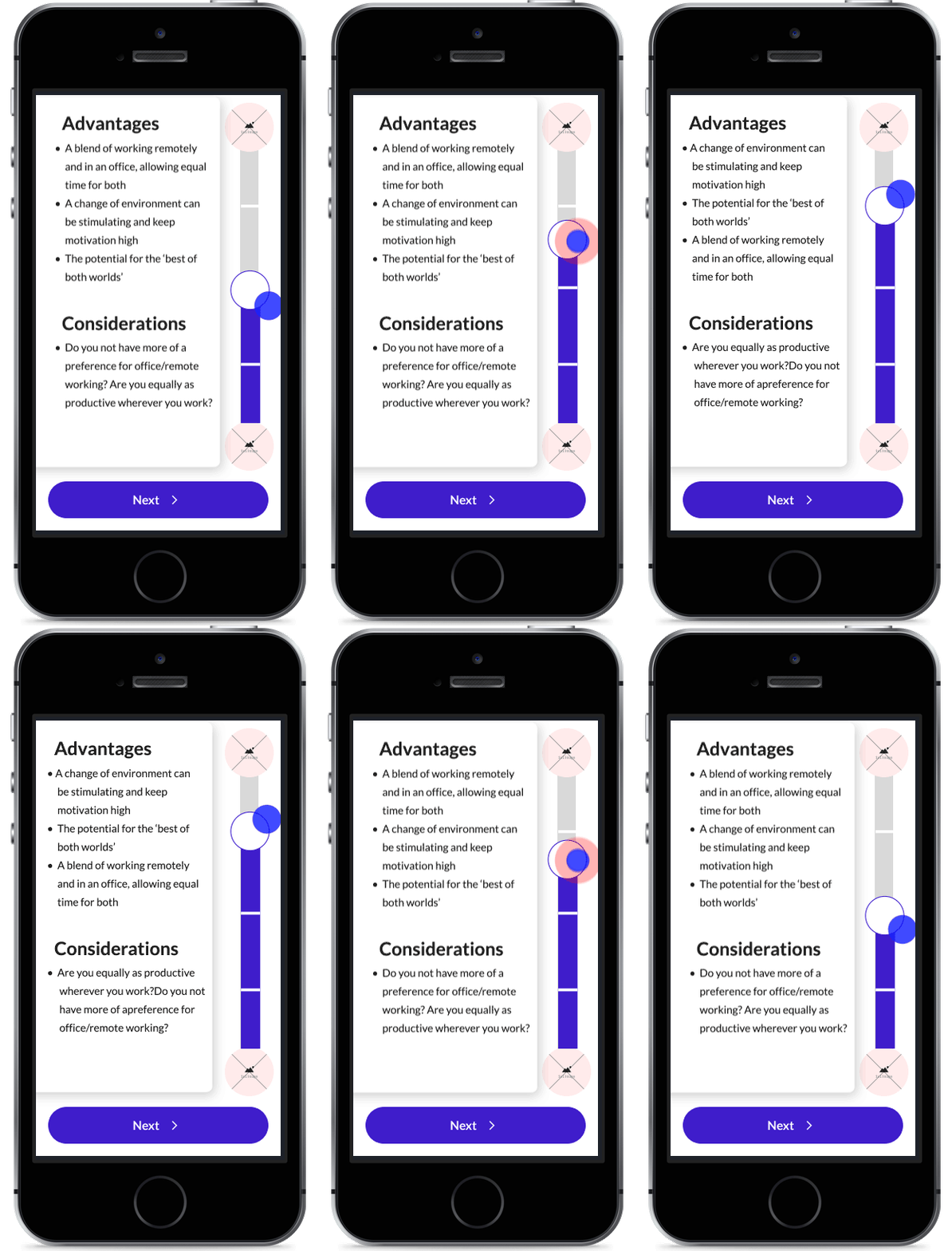
Below are a few examples of the interactions I have designed as components within the components. These interactions have been storyboarded and timings have been provided to developers as part of the process.
My Services
I am experienced working on web, platform & in multi-disciplinary teams
Web Design
- WCAG
- Accessibility
- Mobile-first
- Colour, hierarchy, typography & layout
- Best practice
- Insight and research
Mobile Applications
- Platform guidelines
- Style guides
- Iconography
- Layout
- User journeys
Graphic Design
- Branding
- Logo design
- Illustration and iconography
- Magazines, leaflets, books and all forms of printed literature
- Typography
Motion graphics
- Storyboarding
- Illustration
- Film
- Animatics
- Content creation
- Explainer videos
- Projection mapping
- Storytelling

Tim has delivered an exceptional body of work which was on time and on budget. We've really enjoyed working together and look forward to collaborating on any new projects together!
— Hanna Ager

I enjoy working with Tim to kick-start projects, ideate and work through from end-to-end journeys. He's a dedicated, hard-working designer who clearly loves what he does and will always knock our expectations 'out of the park!'
— Chris Davies
