gloodoo
Gloodoo is a SaaS platform which allows employers to manage and engage with their employees. It offers a suite of apps for platform and web so users can message, set tasks, send rewards, view social media feeds, store documents on mobile, tablet and desktop. This helps them work more efficiently within their team and the wider company.
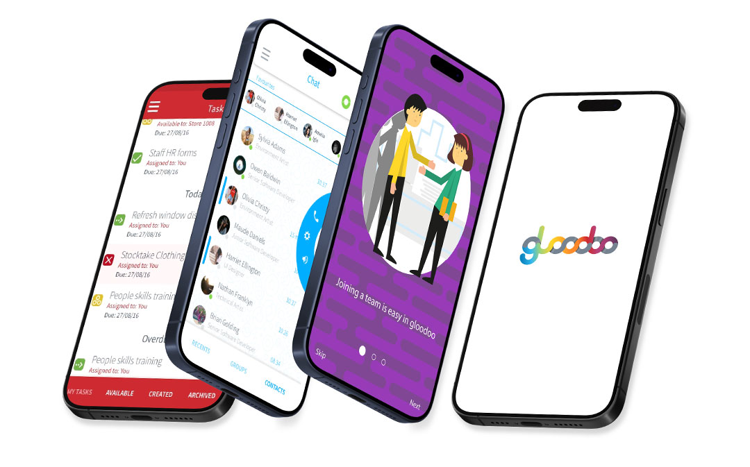
gloodoo mobile app
UX/UI
The mobile app was integral to the gloodoo ecosystem.
What I did
- Research
- Wireframing
- Prototyping
- UX/UI
gloodoo was previously known as 'Focalpoint'. It was a desktop product built out to mobile. gloodoo was launched to be a mobile first product with a user centred approach to features and development.
Response
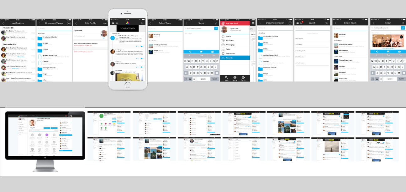
At this point I joined the company and tasked myself to analyse and raise any concerns on UX and UI. My initial thoughts were: No UI guidelines, multiple styles of components used throughout the app, over-use of icons, icons within desktop components used within mobile environment. The information architecture was not mapped out clearly, the navigation around screens was complicated and time-consuming, icons were scaled down without consideration of line-width. There was no opportunity for white labelling and theming to a clients branding.
Whiteboard sketches
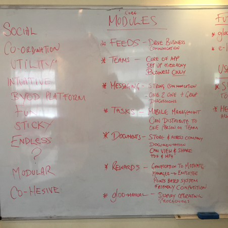
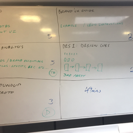
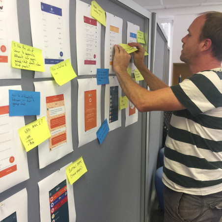
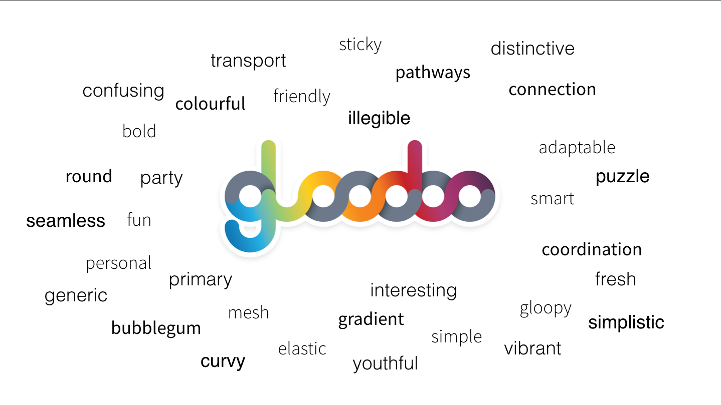
Wordcloud images
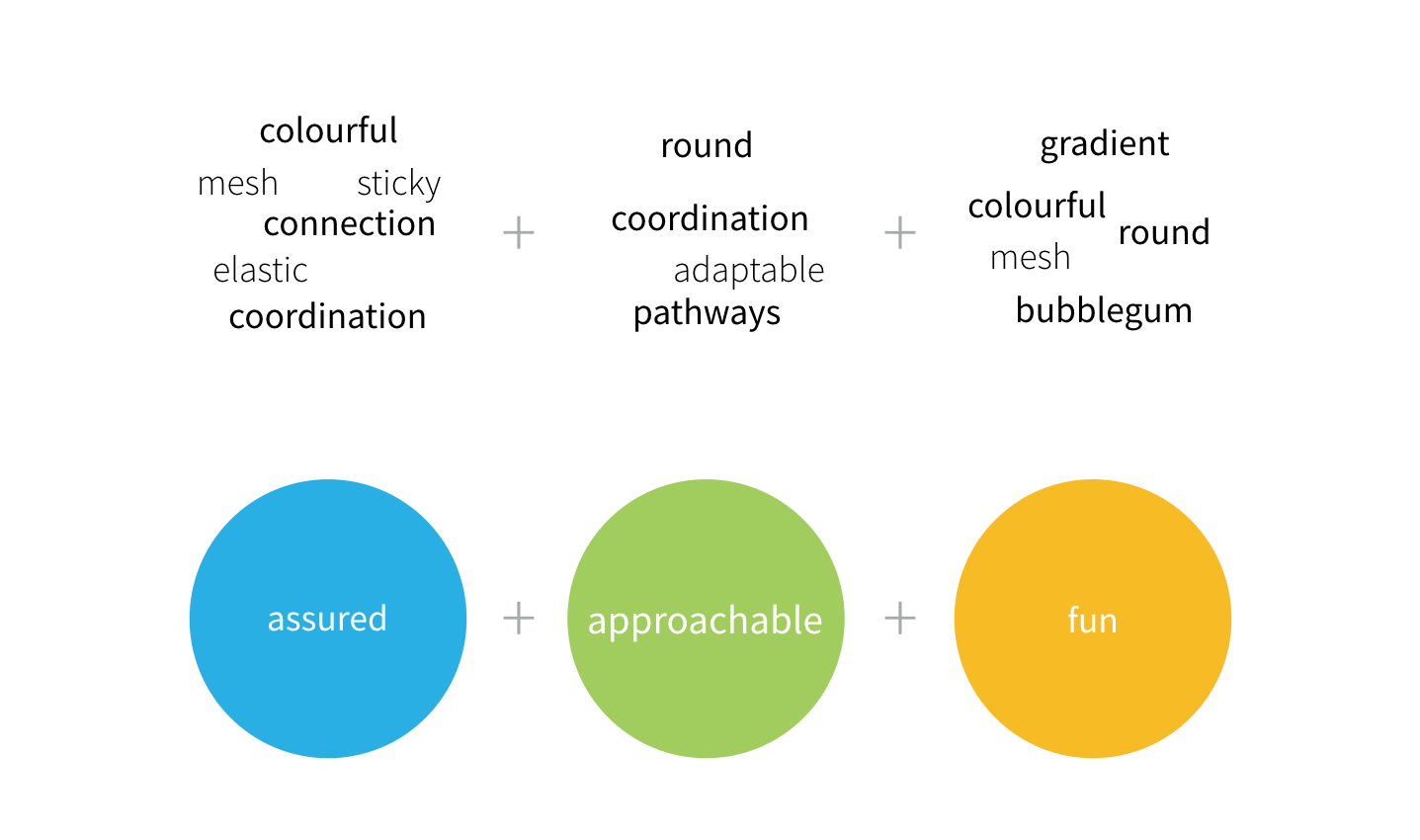
We identified the key components which existed in the website and app and aimed to provide uniformity and consistency across the platforms.
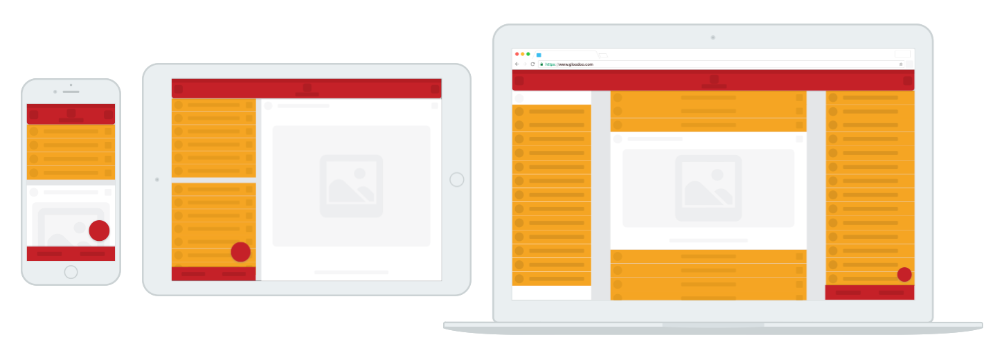
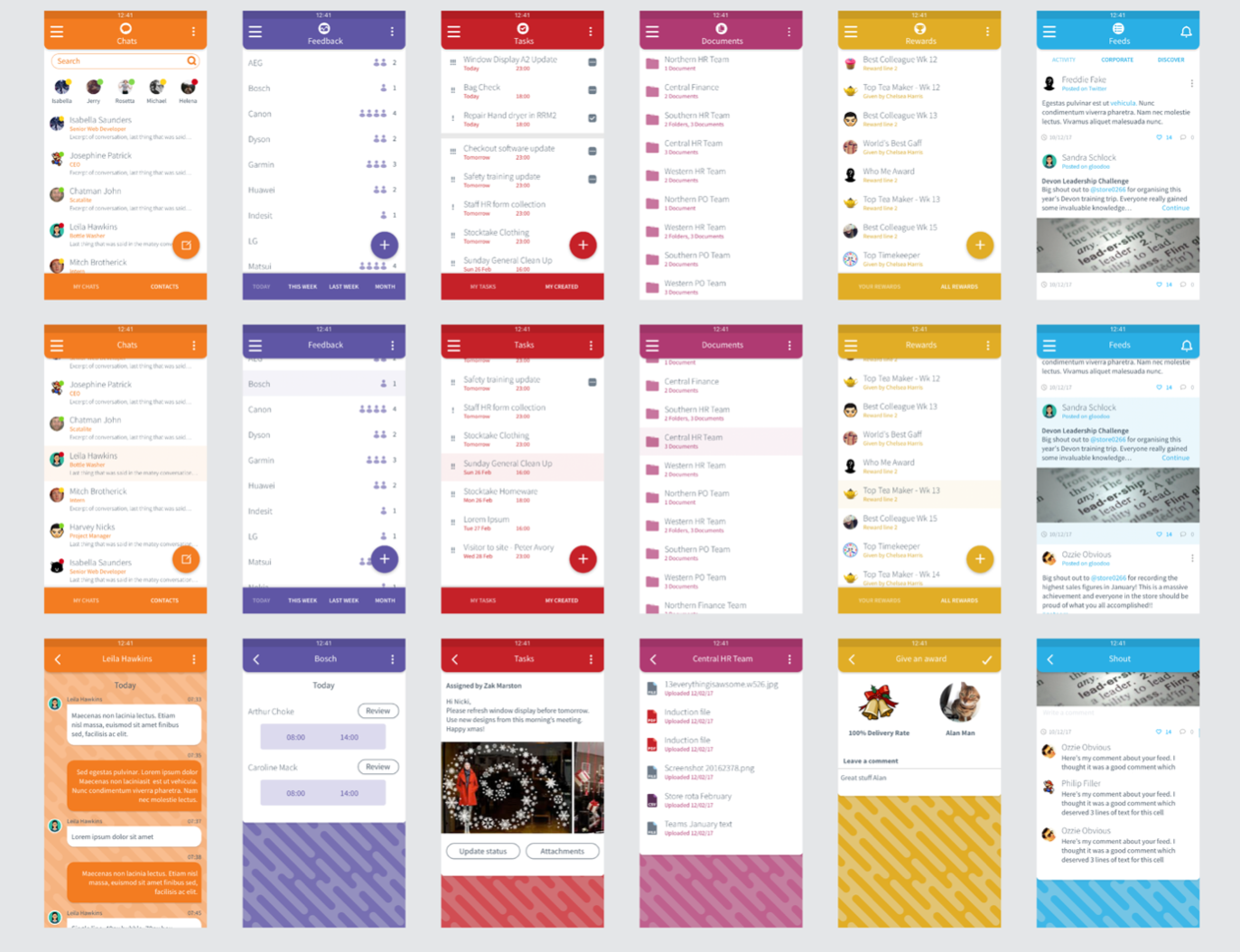
The gloodoo suite redesigned and themed with their own colour-set.
Illustration
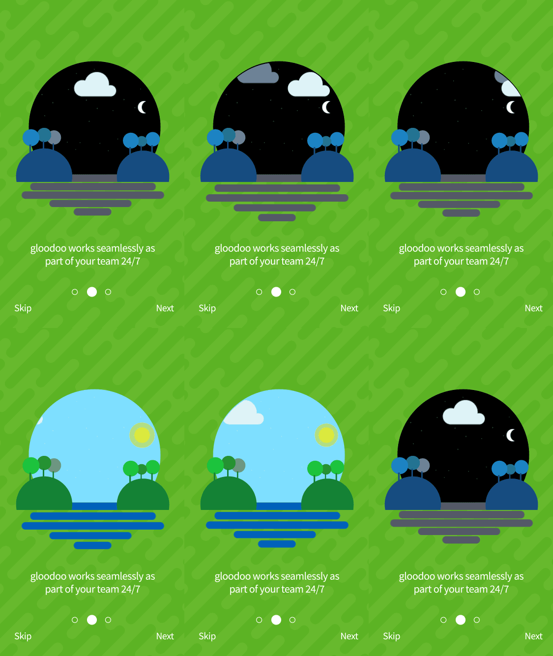
As part of the redesign, I investigated the use of illustration and motion within the app. I benchmarked our competitors such as Microsoft, Slack and Flock
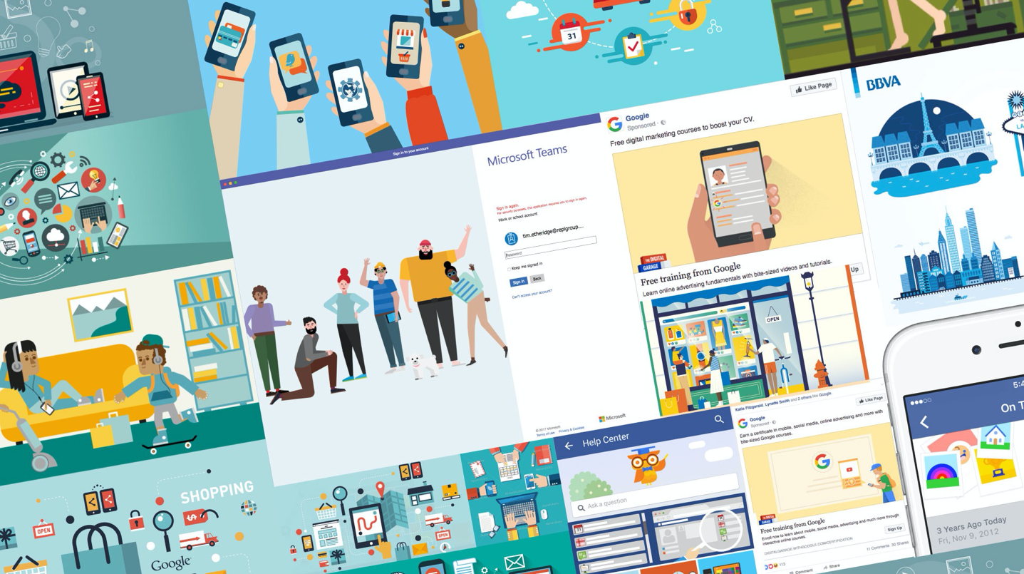
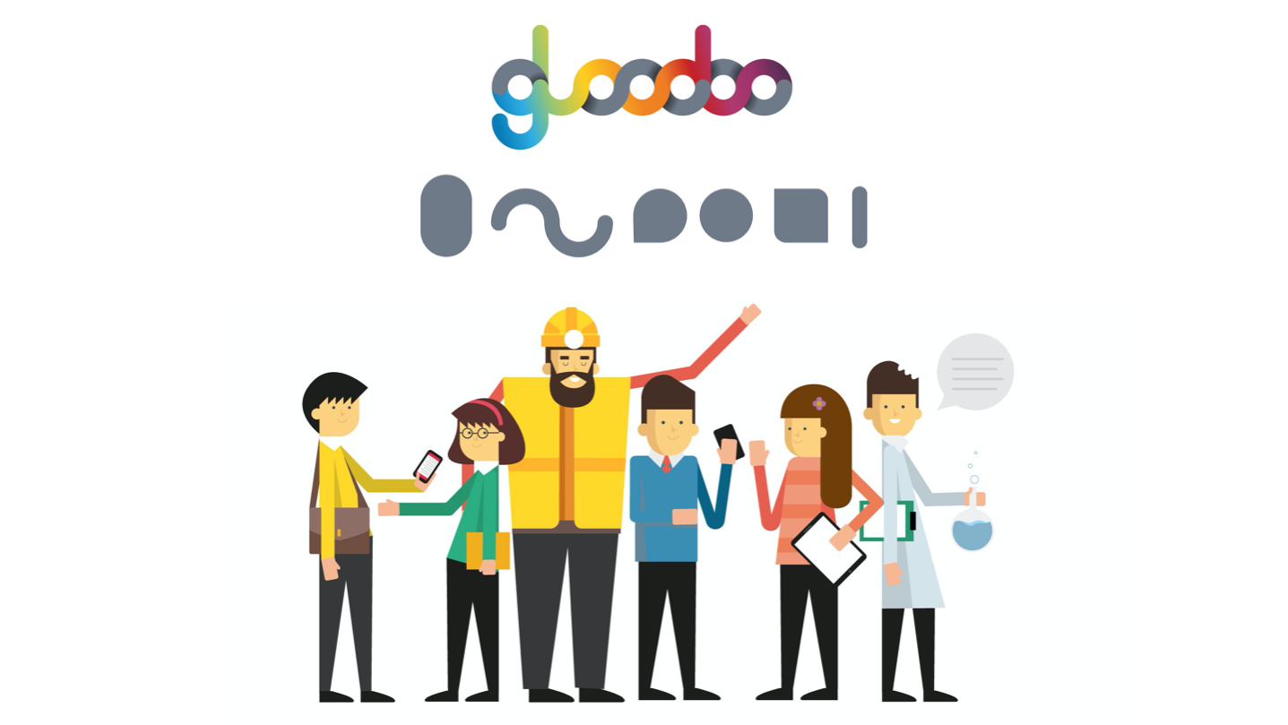
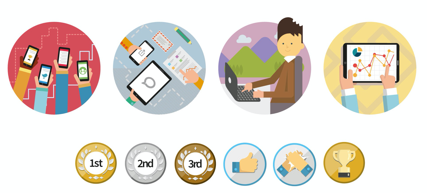
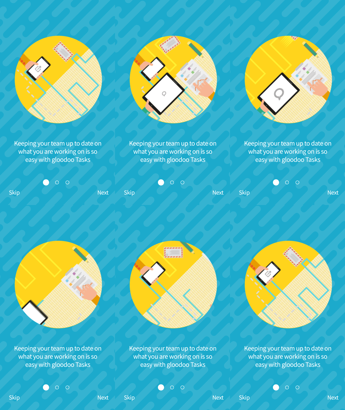
Taking the geometric shapes from the gloodoo logo, I developed an illustration style which was applied to all aspects of the gloodoo suite.
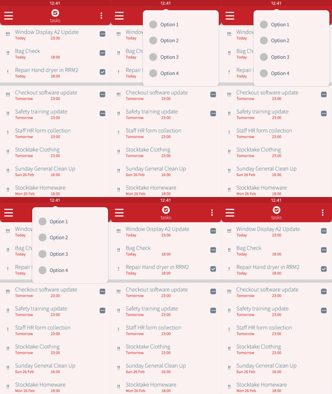
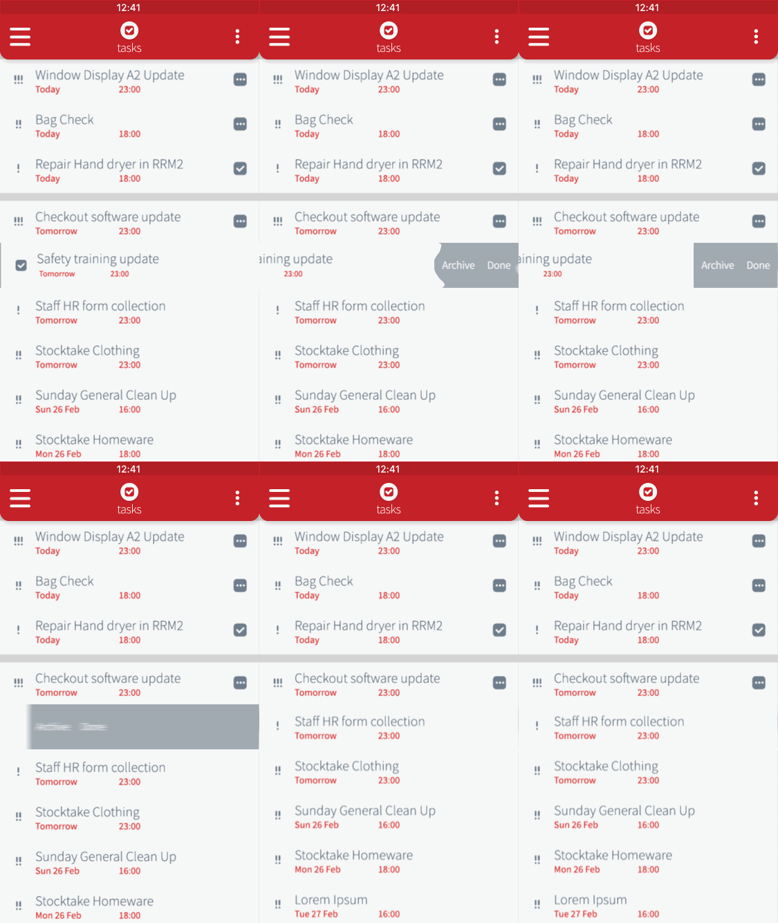
Animations used within the app
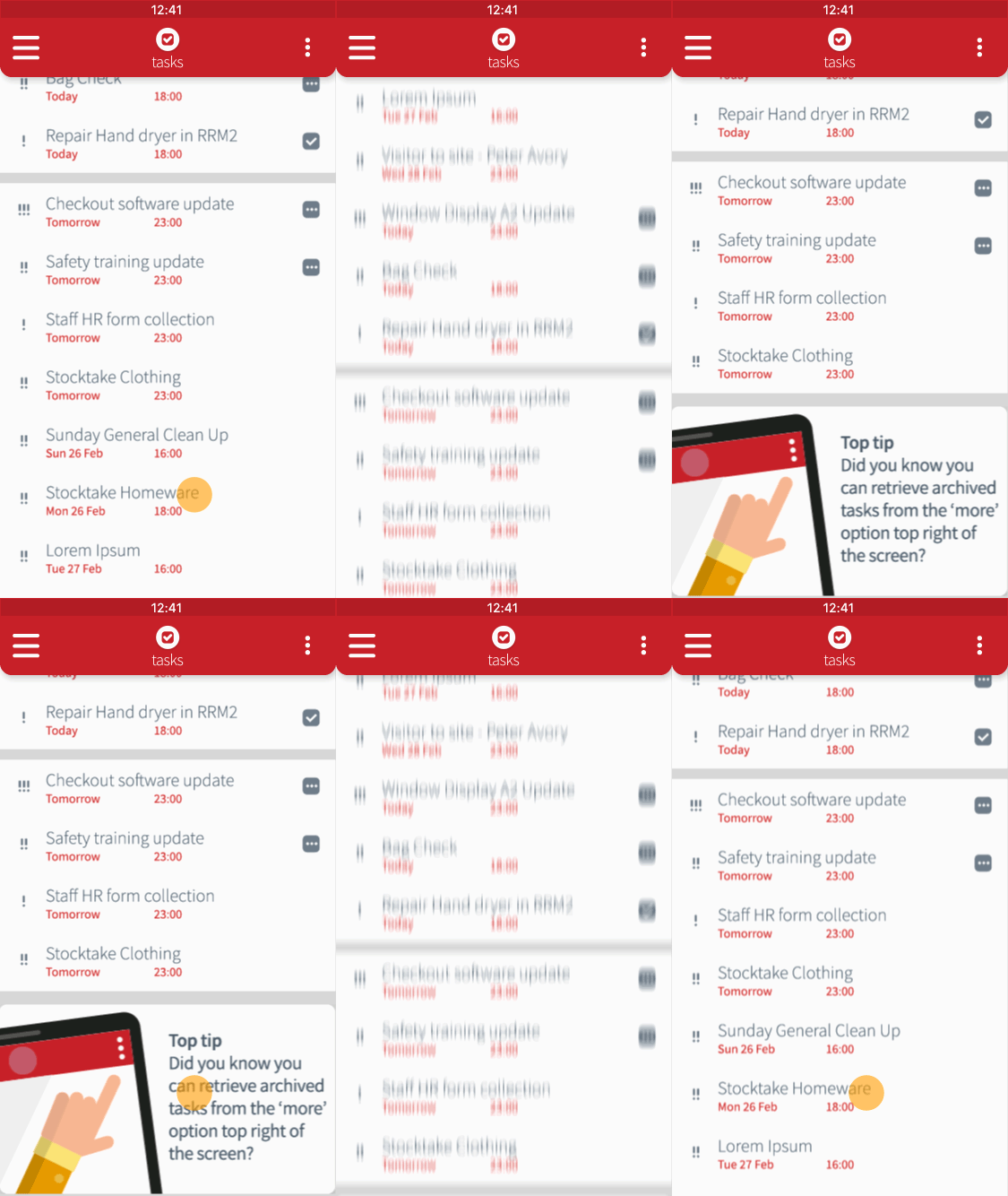

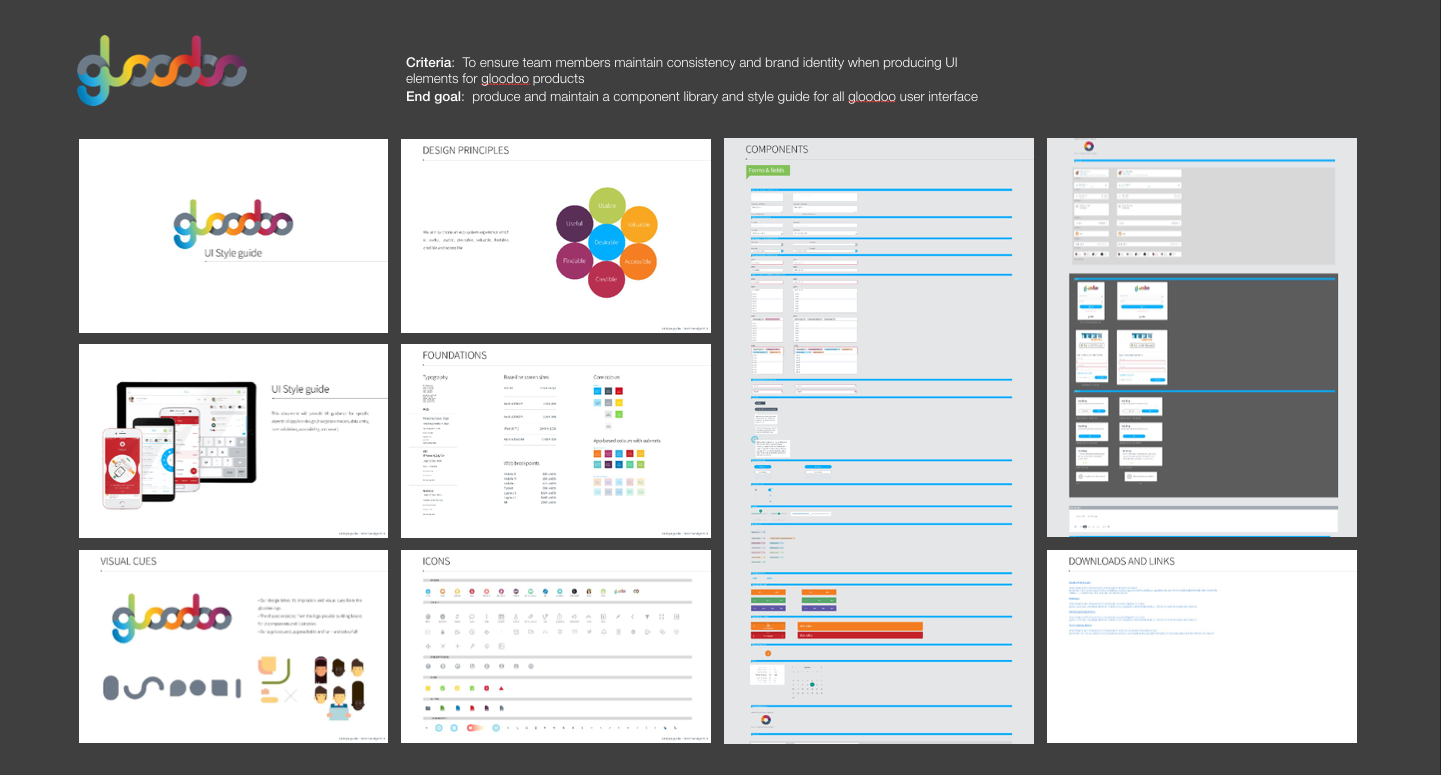
Below is a small sample of the pattern library captured on the development of the app and website. The pattern library would capture all elements required for web and platform. This would be built upon the principles of the atomic design system. We were also in the process of building a webpage style guide - using live code to demonstrate and document the web components.
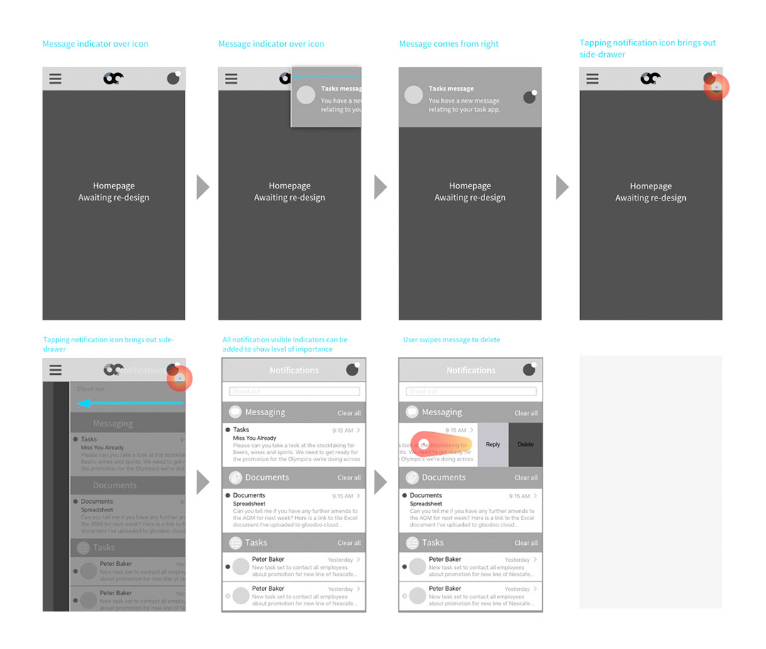
Demonstrating how a notification would appear then be deleted on screen
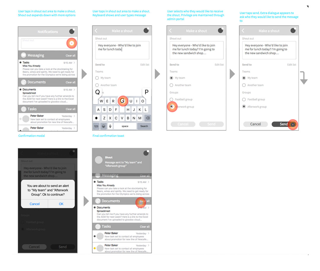
Demonstrating how to make send a notificaion to the team
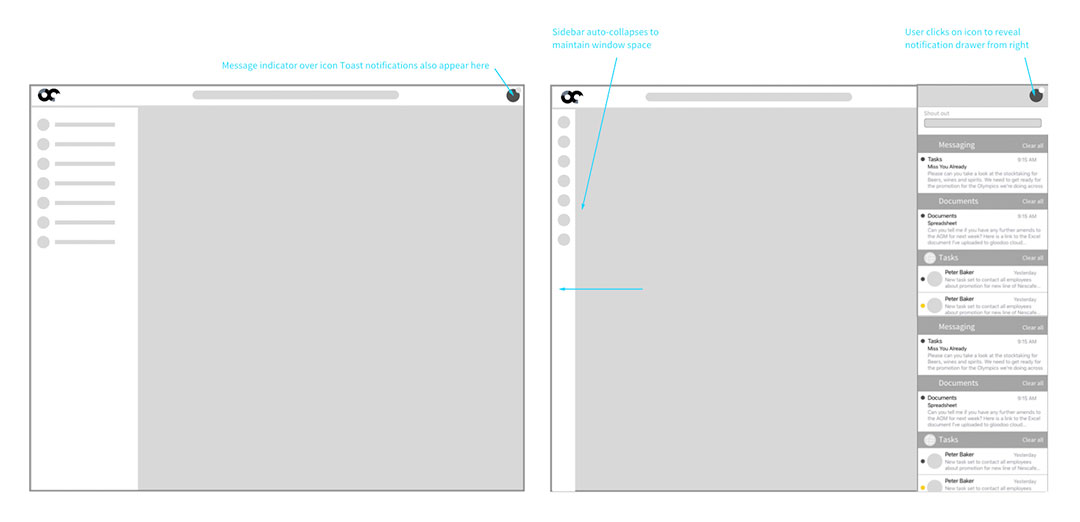
Showing summary notifications tray on desktop
My Services
I am experienced working on web, platform & in multi-disciplinary teams
Web Design
- WCAG
- Accessibility
- Mobile-first
- Colour, hierarchy, typography & layout
- Best practice
- Insight and research
Mobile Applications
- Platform guidelines
- Style guides
- Iconography
- Layout
- User journeys
Graphic Design
- Branding
- Logo design
- Illustration and iconography
- Magazines, leaflets, books and all forms of printed literature
- Typography
Motion graphics
- Storyboarding
- Illustration
- Film
- Animatics
- Content creation
- Explainer videos
- Projection mapping
- Storytelling

Tim has delivered an exceptional body of work which was on time and on budget. We've really enjoyed working together and look forward to collaborating on any new projects together!
— Hanna Ager

I enjoy working with Tim to kick-start projects, ideate and work through from end-to-end journeys. He's a dedicated, hard-working designer who clearly loves what he does and will always knock our expectations 'out of the park!'
— Chris Davies
